I’m attempting to plot phase arrivals in Matplotlib, using the TaupPyModel.get_travel_times. I’ve managed to extract the arrival times and add them to the event time to get a predicted arrival at a seismometer. These are in a UTC timestamp. The problem I’m having is that I need to convert the UTC time to Matplotlib time, but I can’t seem to get it working. It just states that datetime.date object is not callable.
I’ve added the part of my code I need working below, any suggestions or alternatative way would be a great helpful.
Cheers,
Alex
import matplotlib.dates as dates
from obspy import UTCDateTime
from obspy.taup import TauPyModel

ev_time = "2020-07-22 06:12:44"
ev_depth = 28
ev_dist = 69.6

t = UTCDateTime(ev_time)
model = TauPyModel(model = 'iasp91')
arrivals = model.get_travel_times(source_depth_in_km = ev_depth, distance_ in_degree = ev_dist)
arr_time = t + arrivals[0].time
arr_time2 = dates.date2num(arr_time) # This is where the error occurs, I believe
I got the timestamp from the obspy UTC function, then converted it from timestamp to the python dates format, then converted that dat format to a number. This worked. What I wrote is below.
Any easier way to do this I’d love to hear.
import matplotlib.dates as dates
from obspy import UTCDateTime
from obspy.taup import TauPyModel
import datetime

ev_time = "2020-07-22 06:12:44"
ev_depth = 28
ev_dist = 69.6

t = UTCDateTime(ev_time)
model = TauPyModel(model = 'iasp91')
arrivals = model.get_travel_times(source_depth_in_km = ev_depth, distance_ in_degree = ev_dist)
arr_time = t + arrivals[0].time
arr_time2 = datetime.datetime.utcfromtimestamp(arr_time)
arr_time3 = dates.date2num(arr_time2)

# Then later during the plotting part of the script
plt.axvline(x=arr_time3)
To see if I have understood the issue in the correct way since this code is giving me an error on this line:
arr_time2 = datetime.datetime.utcfromtimestamp(arr_time)
   TypeError: an integer is required (got type UTCDateTime)
you need to get the phase arrival time in seconds (?) to use it then as coordinate to plot it on a chart? And you are starting from the UTC time of the event. Is this right?
Yes , I am using the event time and adding the arrival time of a phase to plot onto a matplotlib plot.
I got that error initially, which is why I used the timestamp and added the phase arrival, then used the DateTime module to convert it to utc again, as the obspy utc didn’t appear to work.
EDIT: Sorry, reading that again I should have written the above line as:
No worries, and thank you for the further explanation.
Then, I think you can do it with the following code, which displays two different methods of writing a phase arrival time:
import matplotlib.dates as dates
from obspy import UTCDateTime
from obspy.taup import TauPyModel
import datetime

ev_time = "2020-07-27 06:12:44"

#convert the ev_time from string to datetime format
ev_time_conv = datetime.datetime.strptime(ev_time, '%Y-%m-%d %H:%M:%S')

ev_depth = 28
ev_dist = 69.6

t = UTCDateTime(ev_time)
model = TauPyModel(model = 'iasp91')
arrivals = model.get_travel_times(source_depth_in_km = ev_depth, distance_in_degree = ev_dist)

#get the phase time from the arrivals
phase_time = arrivals[0].time

#add phase time to original event time
plot_time = ev_time_conv + datetime.timedelta(seconds=phase_time)

print(ev_time_conv)
print(phase_time)
print(plot_time)
If you want just the seconds as a reference for the matplotlib plot, then you can use the phase_time variable.
If you instead want to substitute the label with the actual year-month-day hours-minutes-seconds, then the plot_time variable, derived from using datetime.timedelta, can be used. Or, you can use this value directly if your plot is set in this way.
I hope I managed to explain myself in an understandable way. If you have any further questions, feel free to write.
Thank you for this, this is useful to know and will prevent a bit of toing and froing in my code for one variable.
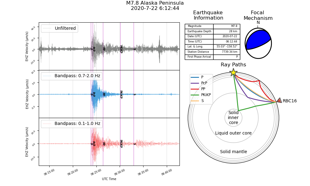
Just to let you know what I’m working with at the moment, I’ve attached an example of an image my code has produced. Still working on a few kinks but I think it’s coming along quite well.
You’re welcome, exchanging ideas and methods is always a way to grow.
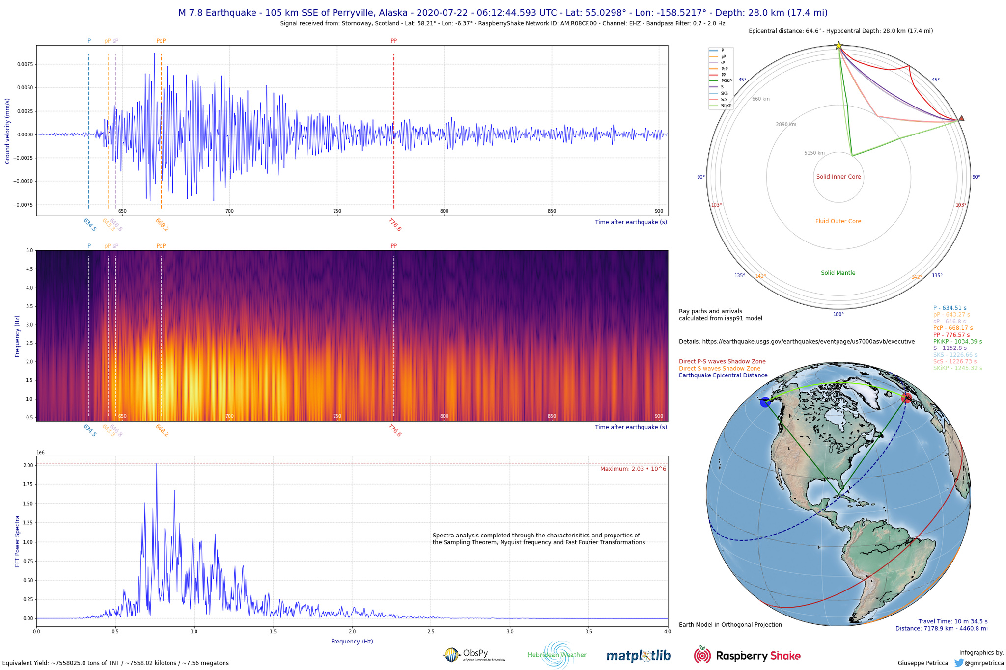
It is indeed a great chart, I like the multiple filtering comparison! I have been working on a similar project in my spare time since some months ago, prompted by the community here and on Twitter. Here’s a sample for the same earthquake:
Thank you, I appreciate the compliment. That is an impressive plot, I like all the information it portrays and the different plots and styles that work together very well.
I aim to hopefully create something to that standard, when I’m a bit more experienced and comfortable with python in general.
Thank you again for your help, and I’m glad I’ve helped you in a kind of way, even if it is just making you think about your code.
Thank you so much! That is an old code, so I have to look around a bit to find it.
In the meanwhile, if you are in need of a quick solution, sheeny has even more complete figures already available that you can find here: My current Python Report for code examples
Hello Stormchaser,
Your image is quite useful. Could I contact you? I am analyzing some earthquakes for my thesis. My email is [email protected]. Thank’s.