Boom Event Report

I thought I’d share a Python module I’ve written for the Raspberry (Shake and) Boom.

Though I have programming experience from pre-windows days (Fortran, Basic, Pascal, and machine code) and some Visual Basic experience 15 to 20 years ago, I’ve only played with Python since getting the RS&B. So Python and Obspy is all relatively new to me. This is the first real result since starting to learn Python and how to handle the instrument response.

I hope it helps someone to learn or get started with Python and Obspy. I am also happy for suggestions and feedback about any errors. For example, y axis range on the PSD doesn’t seem to agree with SWARM or Dataview, so I may be missing something there.

Here’s what the output looks like:

1 Like

Thank you for the code share, sheeny!

I am sure that other users will find this very helpful for their first steps in Python/Obspy programming, and the fact that the output provides so much information it’s a welcome bonus.

1 Like

One comment:

Presenting the code as an image prevents people copying it to try out themselves.
If that was the intent, much better to include it as text.

Philip

Hi Philip,

I tried posting the code as text between quotes [quote][/quote] but it turned the #comments into headers and did some strange things, so I went back to the screenshot.

OK, after having a look at some page source code here’s the code:


from obspy.clients.fdsn import Client
from obspy import UTCDateTime
import matplotlib.pyplot as plt
from obspy.signal import filter

# define start and end times
start = UTCDateTime(2022, 4, 11, 9, 20, 00) # (YYYY, m, d, H, M, S)
end = start + 10                # start plus plot duration in seconds (recommend a minimum of 10s)

# define fdsn client to get data from
client = Client('RASPISHAKE')

# get data from the FSDN server and detrend it
STATION = "R21C0"               # station name
st = client.get_waveforms("AM", STATION, "00", "HDF", starttime=start, endtime=end, attach_response=True)
st.merge(method=0, fill_value='latest')
st.detrend(type="demean")

# get Instrument Response
inv = client.get_stations(network="AM", station=STATION, level="RESP")

# set-up figure and subplots
fig = plt.figure(figsize=(12,8))    #12 x 8 inches
ax1 = fig.add_subplot(6,2,(1,3))    #left top 2 high
ax2 = fig.add_subplot(6,2,(5,7))    #left middle 2 high
ax3 = fig.add_subplot(6,2,(2,6))    #right top 3 high
ax4 = fig.add_subplot(6,2,(8,12))   #right bottom 3 high
ax5 = fig.add_subplot(6,2,(9,11))   #left bottom 2 high
fig.suptitle("AM."+STATION+'.00.HDF Channel '+start.strftime('%d/%m/%Y %H:%M:%S UTC'))


# plot the raw curve
ax1.plot(st[0].times(reftime=start), st[0].data, lw=1)

#plot the PSD
ax2.psd(x=st[0], NFFT=512, noverlap=2, Fs=100, color='r', lw=1)
ax2.set_xscale('log')

#plot spectrogram
ax5.specgram(x=st[0], NFFT=64, noverlap=16, Fs=100, cmap='plasma')
ax5.set_yscale('log')
ax5.set_ylim(0.5,50)

# set up filter
filt = [0.3, 0.5, 10, 12]   #edit filter values to suit

# remove instrument response
resp_removed = st.remove_response(inventory=inv,pre_filt=filt,output="DEF", water_level=60)

# plot the filtered and corrected, and dB curves
ax3.plot(st[0].times(reftime=start), resp_removed[0].data, lw=1, color='g')
ax4.plot(st[0].times(reftime=start), 93.979400087*abs(resp_removed[0].data), lw=1, color='b')

# set-up some plot details
ax1.set_ylabel("Counts")
ax2.set_ylabel("Power Spectral Density")         
ax3.set_ylabel("Pascals (Pa) ("+str(filt[1])+" to "+str(filt[2])+"Hz)")
ax4.set_ylabel("Decibels [dB] ("+str(filt[1])+" to "+str(filt[2])+"Hz)")
ax5.set_ylabel("Frequency, Hz")
ax1.set_xlabel("Seconds after start")
ax3.set_xlabel("Seconds after start")
ax4.set_xlabel("Seconds after start")
ax5.set_xlabel("Seconds after start")

ax1.grid(color='dimgray', ls = '-.', lw = 0.33)
ax2.grid(color='dimgray', ls = '-.', lw = 0.33)
ax3.grid(color='dimgray', ls = '-.', lw = 0.33)
ax4.grid(color='dimgray', ls = '-.', lw = 0.33)
ax5.grid(color='dimgray', ls = '-.', lw = 0.33)

#adjust subplots for readability
plt.subplots_adjust(hspace=1)

# save the final figure
#plt.savefig(STATION+' HDF '+start.strftime('%Y%m%d %H%M%S UTC'))  #comment this line out till figure is final

# show the final figure
plt.show()

Enjoy.

Al.

3 Likes

Since writing this report, I have found it contains in incorrect calculation for the decibel level. In some cases I found it gave impossibly high decibel figures and after much research found the error in the code I copied from another example. The source I copied that I believe is incorrect is here:
https://manual.raspberryshake.org/developersCorner.html#converting-counts-to-pascal-to-decibel-using-obspy

I think I have the code right for the calculation of the decibels now, but as the calculation is more involved than before and include logarithms, I haven’t been able to apply this to a trace to give a decibel plot. So for now I have settled for a peak decibel calculation.

This what the corrected report looks like:

And here is the code:


from obspy.clients.fdsn import Client
from obspy import UTCDateTime
import matplotlib.pyplot as plt
import numpy as np
import math

def time2UTC(a):        #convert time (seconds) since event back to UTCDateTime
    return eventTime + a

def uTC2time(a):        #convert UTCDateTime to seconds since the event
    return a - eventTime

def one_over(a):            # 1/x to convert frequency to period
    #Vectorized 1/a, treating a==0 manually
    a = np.array(a).astype(float)
    near_zero = np.isclose(a, 0)
    a[near_zero] = np.inf
    a[~near_zero] = 1 / a[~near_zero]
    return a

inverse = one_over          #function 1/x is its own inverse

def power_units(a):
    if a >= 1000000:
        return str(round(a/1000000,3))+'MW. ('
    elif a>=1000:
        return str(round(a/1000,3))+'kW. ('
    else:
        return str(round(a,3))+'W. ('

# define start and end times
eventTime = UTCDateTime(2023, 2, 8, 22, 3, 45) # (YYYY, m, d, H, M, S)
delay = -60               #delay from event time to start of plot
start = eventTime + delay   #calculate the plot start time
duration = 120               #duration of plot in seconds
end = start + duration                # start plus plot duration in seconds (recommend a minimum of 10s)

# Name the Event
eventName = 'Lightning'       # Name for the Report
distance = '3408m'          #distance to the source (use unknown if required)
notes1 = ' Thunder travel time = 9.936s = 3.408km.'  #add notes about event if desired
notes2 = ''     #add more notes if req'd

# define fdsn client to get data from
client = Client('https://data.raspberryshake.org/')

# get data from the FSDN server and detrend it
STATION = "R21C0"               # station name
st = client.get_waveforms("AM", STATION, "00", "HDF", starttime=start, endtime=end, attach_response=True)
st.merge(method=0, fill_value='latest')
st.detrend(type="demean")

# get Instrument Response
inv = client.get_stations(network="AM", station=STATION, level="RESP")

# set-up figure and subplots
fig = plt.figure(figsize=(12,8))    #12 x 8 inches
ax1 = fig.add_subplot(6,2,(1,3))    #left top 2 high
ax2 = fig.add_subplot(6,2,(5,7))    #left middle 2 high
ax3 = fig.add_subplot(6,2,(2,8))    #right top 4 high
ax5 = fig.add_subplot(6,2,(9,11))   #left bottom 2 high
fig.suptitle(eventName+' - '+eventTime.strftime('%d/%m/%Y %H:%M:%S.%f UTC'), size='x-large',color='b')
fig.text(0.1, 0.92, 'Distance: '+distance)
fig.text(0.05, 0.04, 'NOTES: '+notes1, size='small')
fig.text(0.05, 0.025, notes2, size='small')
fig.text(0.92, 0.94, 'Station: AM.'+STATION+'.00.HDF Channel', size='small', rotation=90, va='top')
fig.text(0.935, 0.94, 'Raspberry Shake and Boom', size='small', rotation=90, va='top', color='r')
fig.text(0.95, 0.94, '@AlanSheehan18', size='small', rotation=90, va='top')
fig.text(0.92, 0.025, '#Python', size='small', rotation=90, va='bottom')
fig.text(0.935, 0.025, '#MatPlotLib', size='small', rotation=90, va='bottom')
fig.text(0.95, 0.025, '#Obspy', size='small', rotation=90, va='bottom')
fig.text(0.92, 0.5, '#CitizenScience', size='small', rotation=90, va='center')
fig.text(0.935, 0.5, '@raspishake', size='small', rotation=90, va='center')
fig.text(0.95, 0.5, '#ShakeNet', size='small', rotation=90, va='center')

# plot the raw curve
ax1.plot(st[0].times(reftime=eventTime), st[0].data, lw=1)

#plot the PSD
ax2.psd(x=st[0], NFFT=512, noverlap=2, Fs=100, color='r', lw=1)
ax2.set_xscale('log')

#plot spectrogram
ax5.specgram(x=st[0], NFFT=64, noverlap=16, Fs=100, cmap='plasma')
#ax5.set_yscale('log')
ax5.set_ylim(0.5,50)

# set up filter
filt = [0.5, 0.5, 49, 50]   #edit filter values to suit

# record filter settings
fig.text(0.55, 0.92,'Bandpass Filter: '+str(filt[1])+' to '+str(filt[2])+' Hz.')
         
# remove instrument response
resp_removed = st.remove_response(inventory=inv,pre_filt=filt,output="DEF", water_level=60)

# plot the filtered and corrected, and dB curves
ax3.plot(st[0].times(reftime=eventTime), resp_removed[0].data, lw=1, color='g')

#calculate maximum sound power
pmax = abs(resp_removed[0].max())   #find the max pressure amplitude
print(pmax)
splmax = 10*math.log10(pmax*pmax) + 93.979400087        #convert to sound pressure level
print(splmax)
distancem = 3408                    #enter distance in metres! Enter 0 to omit.
sintensity = pmax*pmax/397.2    #calculate the sound intensity, W/m/m
print(sintensity,'W/m²')
spower = sintensity*4*math.pi*distancem*distancem      #calculate the sound power at the source in W for a point source
spower_line = sintensity*2*math.pi*distancem      #calculate the sound power at the source in W for a line source
print(spower, 'W')
print(spower_line, 'W.')

#plot secondary axes - set time interval (dt) based on the duration to avoid crowding
if duration <= 9:
    dt=1           #1 seconds
elif duration <= 18:
    dt=2           #2 seconds
elif duration <= 45:
    dt=5           #5 seconds
elif duration <= 90:
    dt=10           #10 seconds
elif duration <= 180:
    dt=20          #20 seconds
elif duration <= 270:
    dt=30          #30 seconds
elif duration <= 540:
    dt=60           #1 minute
elif duration <= 1080:
    dt=120          #2 minutes
else:
    dt=300          #5 minutes
tbase = start - start.second +(int(start.second/dt)+1)*dt       #find the first time tick
tlabels = []            #initialise a blank array of time labels
tticks = []             #initialise a blank array of time ticks
sticks = []           #initialise a blank array for spectrogram ticks
nticks = int(duration/dt)+1       #calculate the number of ticks
for k in range (0, nticks):
    if dt >= 60:                #build the array of time labels - include UTC to eliminate the axis label
        tlabels.append((tbase+k*dt).strftime('%H:%M'))      #drop the seconds if not required for readability
    else:
        tlabels.append((tbase+k*dt).strftime('%H:%M:%S'))    #include seconds where required
    tticks.append(uTC2time(tbase+k*dt))                         #build the array of time ticks
    sticks.append(uTC2time(tbase+k*dt)-delay)                   #build the array of time ticks for the spectrogram
print(tlabels)                  #print the time labels - just a check for development
print(tticks)                   #print the time ticks - just a  check for development
secax_x1 = ax1.secondary_xaxis('top')       #Raw counts secondary axis
secax_x1.set_xticks(ticks=tticks)
secax_x1.set_xticklabels(tlabels, size='xx-small', va='center_baseline')
secax_x1.set_xlabel('UTC', size='small', labelpad=1)
secax_x2 = ax2.secondary_xaxis('top', functions=(one_over, inverse))        #PSD secondary axis
secax_x2.set_xlabel('Period, s', size='small', alpha=0.5, labelpad=-6)
secax_x3 = ax3.secondary_xaxis('top')       #Pascals secondary axis
secax_x3.set_xticks(ticks=tticks)
secax_x3.set_xticklabels(tlabels, size='xx-small', va='center_baseline')
secax_x3.set_xlabel('UTC', size='small', labelpad=1)
secax_x5 = ax5.secondary_xaxis('top')       #Spectrogram secondary axis
secax_x5.set_xticks(ticks=sticks)
secax_x5.set_xticklabels(tlabels, size='xx-small', va='center_baseline')
secax_x5.set_xlabel('UTC', size='small', labelpad=1)

# set-up some plot details
ax1.set_ylabel("Raw Counts")
ax2.set_ylabel("Power Spectral Density")
ax2.set_xlabel('Frequency,Hz', size='small',labelpad=-4)
ax3.set_ylabel("Pascals (Pa) ("+str(filt[1])+" to "+str(filt[2])+"Hz)")
ax5.set_ylabel("Frequency, Hz")
ax1.set_xlabel("Seconds after event", size='small', labelpad=0)
ax3.set_xlabel("Seconds after event", size='small', labelpad=0)
ax5.set_xlabel("Seconds after start", size='small', labelpad=0)

ax1.grid(color='dimgray', ls = '-.', lw = 0.33)
ax2.grid(color='dimgray', ls = '-.', lw = 0.33)
ax3.grid(color='dimgray', ls = '-.', lw = 0.33)
ax5.grid(color='dimgray', ls = '-.', lw = 0.33)

# Report Peak Calculated Values
fig.text(0.55, 0.25, 'Peak Pressure = '+str(round(pmax,3))+'Pa.')    #report the peak Pressure
fig.text(0.55, 0.23, 'Peak Infrasound Pressure Level ='+str(round(splmax,1))+'dB. ('+str(filt[1])+" to "+str(filt[2])+"Hz)")   #report peak sound pressure level
fig.text(0.55, 0.21, 'Peak Infrasound Intensity = '+str(round(sintensity,6))+'W/m². ('+str(filt[1])+" to "+str(filt[2])+"Hz)")    #report peak intensity
if distancem > 0:
    fig.text(0.55, 0.19, 'Peak Point Source Infrasound Power = '+power_units(spower)+str(filt[1])+" to "+str(filt[2])+"Hz)") #display the source power if it is calculated
    fig.text(0.55, 0.17, 'Peak Line Source Infrasound Power = '+power_units(spower_line)+str(filt[1])+" to "+str(filt[2])+"Hz)") #display the source power if it is calculated

# get the limits of the y axis so text can be consistently placed
ax5b, ax5t = ax5.get_ylim()
ax5.text(2, ax5t*0.7, 'Plot Start Time: '+start.strftime(' %d/%m/%Y %H:%M:%S.%f UTC '), size='small')      # explain difference in x time scale

#adjust subplots for readability
plt.subplots_adjust(hspace=1.2)

# save the final figure
#plt.savefig('F:\Pictures\Raspberry Shake and Boom\\'+eventName+STATION+' HDF '+start.strftime('%Y%m%d %H%M%S UTC'))  #comment this line out till figure is final

# show the final figure
plt.show()

I’d like to know if anyone knows how to apply logarithms to a trace. That would allow a dB plot to be constructed.

Note that I have included two Infrasound Power calculations - one for a point source and one for a line source. In general the point source infrasound power is the one to use for meteors, bolides, explosions, fireworks, distant thunder, etc.

Close thunder/lightning is a different matter however as the lightning is definitely not a point source. Point source sound decreases proportionally to the square of the distance. An infinite line source sound decreases proportionally to the distance! So close lightning/thunder can give an unrealistically high point power. The true power will be between the Point Power and the Line Power for close lightning/thunder.

Al.

1 Like

FYI The second version code has now been replaced to correct for 2 errors found in it.

Al.

While checking and correcting Boom Event Report 2 I realised I can plot the Infrasound Intensity and calculate the point Power at the source also as traces. Boom Event Report 3 is the result. It looks like this:

And here is the code:


from obspy.clients.fdsn import Client
from obspy import UTCDateTime
import matplotlib.pyplot as plt
import numpy as np
import math

def time2UTC(a):        #convert time (seconds) since event back to UTCDateTime
    return eventTime + a

def uTC2time(a):        #convert UTCDateTime to seconds since the event
    return a - eventTime

def one_over(a):            # 1/x to convert frequency to period
    #Vectorized 1/a, treating a==0 manually
    a = np.array(a).astype(float)
    near_zero = np.isclose(a, 0)
    a[near_zero] = np.inf
    a[~near_zero] = 1 / a[~near_zero]
    return a

inverse = one_over          #function 1/x is its own inverse

def power_units(a):
    if a >= 1000000:
        return str(round(a/1000000,3))+'MW. ('
    elif a>=1000:
        return str(round(a/1000,3))+'kW. ('
    else:
        return str(round(a,3))+'W. ('

# define start and end times
eventTime = UTCDateTime(2023, 2, 8, 22, 3, 45) # (YYYY, m, d, H, M, S)
delay = -20               #delay from event time to start of plot
start = eventTime + delay   #calculate the plot start time
duration = 60               #duration of plot in seconds
end = start + duration                # start plus plot duration in seconds (recommend a minimum of 10s)

# Name the Event
eventName = 'Lightning'       # Name for the Report
distance = '3408m'          #distance to the source (use unknown if required)
notes1 = ' Thunder travel time = 9.936s = 3.408km.'  #add notes about event if desired
notes2 = ''     #add more notes if req'd
distancem = 3408                    #enter distance in metres! Enter 0 to omit.

# define fdsn client to get data from
client = Client('https://data.raspberryshake.org/')

# get data from the FSDN server and detrend it
STATION = "R21C0"               # station name
st = client.get_waveforms("AM", STATION, "00", "HDF", starttime=start, endtime=end, attach_response=True)
st.merge(method=0, fill_value='latest')
st.detrend(type="demean")

# get Instrument Response
inv = client.get_stations(network="AM", station=STATION, level="RESP")

# set-up figure and subplots
fig = plt.figure(figsize=(12,8))    #12 x 8 inches
ax1 = fig.add_subplot(6,2,(1,3))    #left top 2 high
ax2 = fig.add_subplot(6,2,(5,7))    #left middle 2 high
ax3 = fig.add_subplot(6,2,(2,4))    #right top 2 high
ax4 = fig.add_subplot(6,2,(6,8))    #right middle 2 high
ax5 = fig.add_subplot(6,2,(9,11))   #left bottom 2 high
if distancem > 0:
    ax6 = fig.add_subplot(6,2, (10, 12))    #right bottom 2 high
fig.suptitle(eventName+' - '+eventTime.strftime('%d/%m/%Y %H:%M:%S.%f UTC'), size='x-large',color='b')
fig.text(0.1, 0.92, 'Distance: '+distance)
fig.text(0.05, 0.04, 'NOTES: '+notes1, size='small')
fig.text(0.05, 0.025, notes2, size='small')
fig.text(0.92, 0.94, 'Station: AM.'+STATION+'.00.HDF Channel', size='small', rotation=90, va='top')
fig.text(0.935, 0.94, 'Raspberry Shake and Boom', size='small', rotation=90, va='top', color='r')
fig.text(0.95, 0.94, '@AlanSheehan18', size='small', rotation=90, va='top')
fig.text(0.92, 0.025, '#Python', size='small', rotation=90, va='bottom')
fig.text(0.935, 0.025, '#MatPlotLib', size='small', rotation=90, va='bottom')
fig.text(0.95, 0.025, '#Obspy', size='small', rotation=90, va='bottom')
fig.text(0.92, 0.5, '#CitizenScience', size='small', rotation=90, va='center')
fig.text(0.935, 0.5, '@raspishake', size='small', rotation=90, va='center')
fig.text(0.95, 0.5, '#ShakeNet', size='small', rotation=90, va='center')

# plot the raw curve
ax1.plot(st[0].times(reftime=eventTime), st[0].data, lw=1)

#plot the PSD
ax2.psd(x=st[0], NFFT=512, noverlap=2, Fs=100, color='r', lw=1)
ax2.set_xscale('log')

#plot spectrogram
ax5.specgram(x=st[0], NFFT=64, noverlap=16, Fs=100, cmap='plasma')
#ax5.set_yscale('log')
ax5.set_ylim(0.5,50)

# set up filter
filt = [0.5, 0.5, 49, 50]   #edit filter values to suit

# record filter settings
fig.text(0.55, 0.92,'Bandpass Filter: '+str(filt[1])+' to '+str(filt[2])+' Hz.')
         
# remove instrument response
resp_removed = st.remove_response(inventory=inv,pre_filt=filt,output="DEF", water_level=60)

# plot the filtered and corrected, and dB curves
ax3.plot(st[0].times(reftime=eventTime), resp_removed[0].data, lw=1, color='g')
ax4.plot(st[0].times(reftime=eventTime), resp_removed[0].data*resp_removed[0].data/397.2, lw=1, color = 'b')
if distancem > 0:
    ax6.plot(st[0].times(reftime=eventTime), resp_removed[0].data*resp_removed[0].data*4*math.pi*distancem*distancem/397.2, lw=1, color = 'r')

#calculate maximum sound pressure level
pmax = abs(resp_removed[0].max())   #find the max pressure amplitude
print(pmax)
splmax = 10*math.log10(pmax*pmax) + 93.979400087        #convert to sound pressure level
print(splmax)

#plot secondary axes - set time interval (dt) based on the duration to avoid crowding
if duration <= 9:
    dt=1           #1 seconds
elif duration <= 18:
    dt=2           #2 seconds
elif duration <= 45:
    dt=5           #5 seconds
elif duration <= 90:
    dt=10           #10 seconds
elif duration <= 180:
    dt=20          #20 seconds
elif duration <= 270:
    dt=30          #30 seconds
elif duration <= 540:
    dt=60           #1 minute
elif duration <= 1080:
    dt=120          #2 minutes
else:
    dt=300          #5 minutes
tbase = start - start.second +(int(start.second/dt)+1)*dt       #find the first time tick
tlabels = []            #initialise a blank array of time labels
tticks = []             #initialise a blank array of time ticks
sticks = []           #initialise a blank array for spectrogram ticks
nticks = int(duration/dt)+1       #calculate the number of ticks
for k in range (0, nticks):
    if dt >= 60:                #build the array of time labels - include UTC to eliminate the axis label
        tlabels.append((tbase+k*dt).strftime('%H:%M'))      #drop the seconds if not required for readability
    else:
        tlabels.append((tbase+k*dt).strftime('%H:%M:%S'))    #include seconds where required
    tticks.append(uTC2time(tbase+k*dt))                         #build the array of time ticks
    sticks.append(uTC2time(tbase+k*dt)-delay)                   #build the array of time ticks for the spectrogram
print(tlabels)                  #print the time labels - just a check for development
print(tticks)                   #print the time ticks - just a  check for development
secax_x1 = ax1.secondary_xaxis('top')       #Raw counts secondary axis
secax_x1.set_xticks(ticks=tticks)
secax_x1.set_xticklabels(tlabels, size='xx-small', va='center_baseline')
secax_x1.set_xlabel('UTC', size='small', labelpad=1)
secax_x2 = ax2.secondary_xaxis('top', functions=(one_over, inverse))        #PSD secondary axis
secax_x2.set_xlabel('Period, s', size='small', alpha=0.5, labelpad=-6)
secax_x3 = ax3.secondary_xaxis('top')       #Pascals secondary axis
secax_x3.set_xticks(ticks=tticks)
secax_x3.set_xticklabels(tlabels, size='xx-small', va='center_baseline')
secax_x3.set_xlabel('UTC', size='small', labelpad=1)
secax_x4 = ax4.secondary_xaxis('top')       #Pascals secondary axis
secax_x4.set_xticks(ticks=tticks)
secax_x4.set_xticklabels(tlabels, size='xx-small', va='center_baseline')
secax_x4.set_xlabel('UTC', size='small', labelpad=1)
secax_x5 = ax5.secondary_xaxis('top')       #Spectrogram secondary axis
secax_x5.set_xticks(ticks=sticks)
secax_x5.set_xticklabels(tlabels, size='xx-small', va='center_baseline')
secax_x5.set_xlabel('UTC', size='small', labelpad=1)
if distancem>0:
    secax_x6 = ax6.secondary_xaxis('top')       #Pascals secondary axis
    secax_x6.set_xticks(ticks=tticks)
    secax_x6.set_xticklabels(tlabels, size='xx-small', va='center_baseline')
    secax_x6.set_xlabel('UTC', size='small', labelpad=1)

# set-up some plot details
ax1.set_ylabel("Raw Counts", size='small')
ax2.set_ylabel("Power Spectral Density", size='small')
ax2.set_xlabel('Frequency,Hz', size='small',labelpad=-4)
ax3.set_ylabel("Pressure (Pa) ("+str(filt[1])+" to "+str(filt[2])+"Hz)", size='small')
ax4.set_ylabel("Infrasound Intensity (W/m²) ("+str(filt[1])+" to "+str(filt[2])+"Hz)", size='x-small')
ax5.set_ylabel("Frequency, Hz", size='small')
if distancem >0:
    ax6.set_ylabel("Power (W) ("+str(filt[1])+" to "+str(filt[2])+"Hz)", size='small')
ax1.set_xlabel("Seconds after event", size='small', labelpad=0)
ax3.set_xlabel("Seconds after event", size='small', labelpad=0)
ax4.set_xlabel("Seconds after event", size='small', labelpad=0)
ax5.set_xlabel("Seconds after start", size='small', labelpad=0)
if distancem>0:
    ax6.set_xlabel("Seconds after event", size='small', labelpad=0)

ax1.grid(color='dimgray', ls = '-.', lw = 0.33)
ax2.grid(color='dimgray', ls = '-.', lw = 0.33)
ax3.grid(color='dimgray', ls = '-.', lw = 0.33)
ax4.grid(color='dimgray', ls = '-.', lw = 0.33)
ax5.grid(color='dimgray', ls = '-.', lw = 0.33)
if distancem>0:
    ax6.grid(color='dimgray', ls = '-.', lw = 0.33)

# Report Peak Calculated Values
fig.text(0.56, 0.85, 'Peak Pressure = '+str(round(pmax,3))+'Pa.')    #report the peak Pressure
fig.text(0.56, 0.7, 'Peak Infrasound Pressure Level ='+str(round(splmax,1))+'dB. ('+str(filt[1])+" to "+str(filt[2])+"Hz)")   #report peak sound pressure level

# get the limits of the y axis so text can be consistently placed
ax5b, ax5t = ax5.get_ylim()
ax5.text(2, ax5t*0.7, 'Plot Start Time: '+start.strftime(' %d/%m/%Y %H:%M:%S.%f UTC '), size='small')      # explain difference in x time scale

#adjust subplots for readability
plt.subplots_adjust(hspace=1.2)

# save the final figure
#plt.savefig('D:\Pictures\Raspberry Shake and Boom\\'+eventName+STATION+' HDF '+start.strftime('%Y%m%d %H%M%S UTC'))  #comment this line out till figure is final

# show the final figure
plt.show()

If the distance to the source is unknown, enter 0 for distancem in line 43 and the Power will not be plotted.

Al.

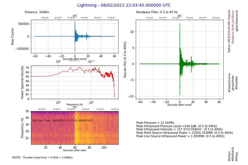
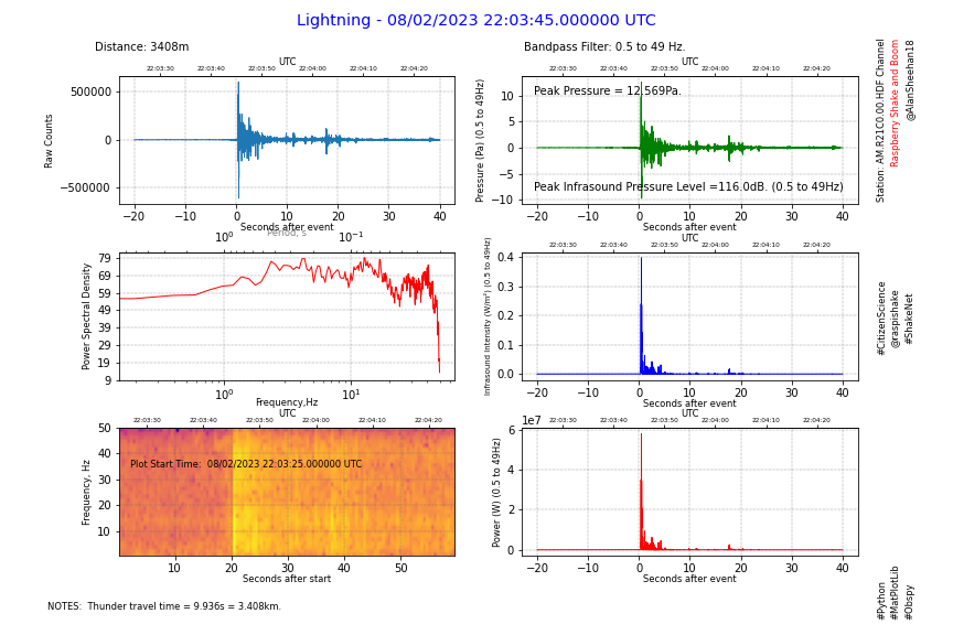
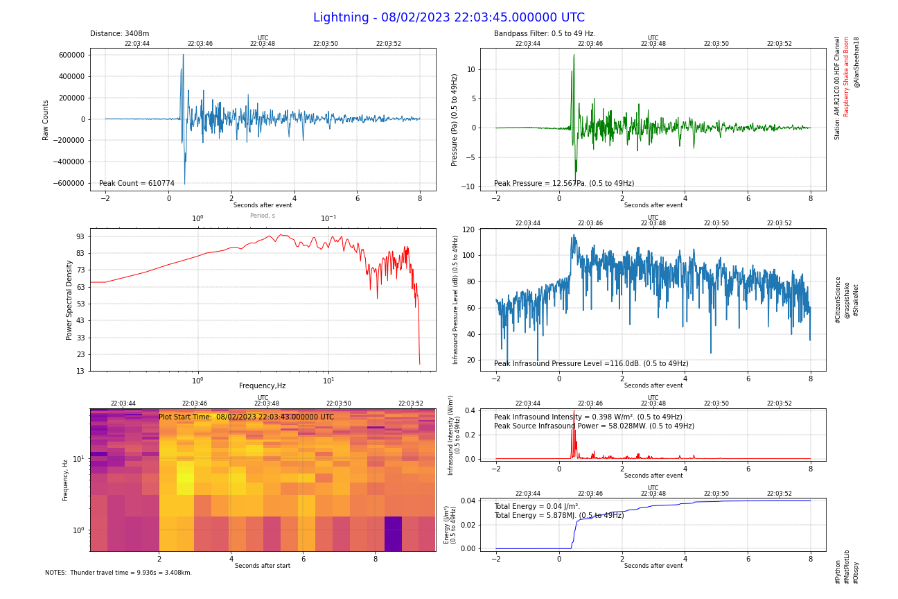
Thanks to Stormchaser and also the Obspy Forum for putting me on the right track with converting Pa to dB in python. As a result I have a new Boom Report that displays:

  1. Raw Counts
  2. PSD
  3. Spectrogram
  4. Filtered Pressure (Pa)
  5. Infrasound Pressure Level (dB)
  6. Infrasound Intensity (W/m²)
  7. Energy Intensity (J/m²)

and when the distance to the source is known…
8. Peak Infrasound Sound Power (W)
9. Total Energy (J) for the event.

If the distance to the source is not known, enter 0 for distancem and the power and energy is not calculated or displayed.

The report looks like this:

And this is the code:


from obspy.clients.fdsn import Client
from obspy import UTCDateTime
import matplotlib.pyplot as plt
import numpy as np
import math

def time2UTC(a):        #convert time (seconds) since event back to UTCDateTime
    return eventTime + a

def uTC2time(a):        #convert UTCDateTime to seconds since the event
    return a - eventTime

def one_over(a):            # 1/x to convert frequency to period
    #Vectorized 1/a, treating a==0 manually
    a = np.array(a).astype(float)
    near_zero = np.isclose(a, 0)
    a[near_zero] = np.inf
    a[~near_zero] = 1 / a[~near_zero]
    return a

inverse = one_over          #function 1/x is its own inverse

def power_units(a):
    if a >= 1000000:
        return str(round(a/1000000,3))+'MW. ('
    elif a>=1000:
        return str(round(a/1000,3))+'kW. ('
    else:
        return str(round(a,3))+'W. ('

def energy_units(a):
    if a >= 1000000:
        return str(round(a/1000000,3))+'MJ. ('
    elif a>=1000:
        return str(round(a/1000,3))+'kJ. ('
    else:
        return str(round(a,3))+'J. ('

# define start and end times
eventTime = UTCDateTime(2023, 2, 8, 22, 3, 45) # (YYYY, m, d, H, M, S)
delay = -2               #delay from event time to start of plot
start = eventTime + delay   #calculate the plot start time
duration = 10               #duration of plot in seconds
end = start + duration                # start plus plot duration in seconds (recommend a minimum of 10s)

# Name the Event
eventName = 'Lightning'       # Name for the Report
distance = '3408m'          #distance to the source (use unknown if required)
notes1 = ' Thunder travel time = 9.936s = 3.408km.'  #add notes about event if desired
notes2 = ''     #add more notes if req'd
distancem = 3408                    #enter distance in metres! Enter 0 to omit.

# define fdsn client to get data from
client = Client('https://data.raspberryshake.org/')

# get data from the FSDN server and detrend it
STATION = "R21C0"               # station name
st = client.get_waveforms("AM", STATION, "00", "HDF", starttime=start, endtime=end, attach_response=True)
st.merge(method=0, fill_value='latest')
st.detrend(type="demean")
cmax = abs(st[0].max())

# get Instrument Response
inv = client.get_stations(network="AM", station=STATION, level="RESP")

# set-up figure and subplots
fig = plt.figure(figsize=(18,12))    #18 x 12 inches
ax1 = fig.add_subplot(6,2,(1,3))    #left top 2 high
ax2 = fig.add_subplot(6,2,(5,7))    #left middle 2 high
ax3 = fig.add_subplot(6,2,(2,4))    #right top 2 high
ax4 = fig.add_subplot(6,2,(6,8))    #right middle 2 high
ax5 = fig.add_subplot(6,2,(9,11))   #left bottom 2 high
ax6 = fig.add_subplot(6,2,10)    #right bottom +1
ax7 = fig.add_subplot(6,2,12)    #right bottom
fig.suptitle(eventName+' - '+eventTime.strftime('%d/%m/%Y %H:%M:%S.%f UTC'), size='xx-large',color='b')
fig.text(0.1, 0.94, 'Distance: '+distance)
fig.text(0.05, 0.04, 'NOTES: '+notes1, size='small')
fig.text(0.05, 0.025, notes2, size='small')
fig.text(0.93, 0.94, 'Station: AM.'+STATION+'.00.HDF Channel', size='small', rotation=90, va='top')
fig.text(0.94, 0.94, 'Raspberry Shake and Boom', size='small', rotation=90, va='top', color='r')
fig.text(0.95, 0.94, '@AlanSheehan18', size='small', rotation=90, va='top')
fig.text(0.93, 0.025, '#Python', size='small', rotation=90, va='bottom')
fig.text(0.94, 0.025, '#MatPlotLib', size='small', rotation=90, va='bottom')
fig.text(0.95, 0.025, '#Obspy', size='small', rotation=90, va='bottom')
fig.text(0.93, 0.5, '#CitizenScience', size='small', rotation=90, va='center')
fig.text(0.94, 0.5, '@raspishake', size='small', rotation=90, va='center')
fig.text(0.95, 0.5, '#ShakeNet', size='small', rotation=90, va='center')

# plot the raw curve
ax1.plot(st[0].times(reftime=eventTime), st[0].data, lw=1)

#plot the PSD
ax2.psd(x=st[0], NFFT=512, noverlap=2, Fs=100, color='r', lw=1)
ax2.set_xscale('log')

#plot spectrogram
ax5.specgram(x=st[0], NFFT=64, noverlap=16, Fs=100, cmap='plasma')
ax5.set_yscale('log')
ax5.set_ylim(0.5,50)

# set up filter
filt = [0.5, 0.5, 49, 50]   #edit filter values to suit

# record filter settings
fig.text(0.55, 0.94,'Bandpass Filter: '+str(filt[1])+' to '+str(filt[2])+' Hz.')
         
# remove instrument response
resp_removed = st.remove_response(inventory=inv,pre_filt=filt,output="DEF", water_level=60)

#copy resp_removed to integrate to calculate the energy of the event
et = resp_removed.copy()
et[0].data = et[0].data*et[0].data/397.2
et[0].integrate(method='cumtrapz')
aemax = abs(et[0].max())
if distancem >0:            #calculate the energy of the event if the distance is known
    emax = aemax*4*math.pi*distancem*distancem

# plot the filtered and corrected, and dB curves
ax3.plot(st[0].times(reftime=eventTime), resp_removed[0].data, lw=1, color='g')
ax4.plot(st[0].times(reftime=eventTime), 20*np.log10(abs(resp_removed[0].data)/0.00002))
ax6.plot(st[0].times(reftime=eventTime), resp_removed[0].data*resp_removed[0].data/397.2, lw=1, color = 'r')
ax7.plot(st[0].times(reftime=eventTime), et[0].data, lw=1, color = 'b')

#calculate maximum sound pressure level sound intensity and source power
pmax = abs(resp_removed[0].max())   #find the max pressure amplitude
print(pmax)
splmax = 10*np.log10(pmax*pmax) + 93.979400087        #convert to sound pressure level
print(splmax)
sintensity = pmax*pmax/397.2    #calculate the sound intensity, W/m/m
print(sintensity,'W/m²')
if distancem >0:        #calculate the power of the event if the distance is known
    spower = sintensity*4*math.pi*distancem*distancem      #calculate the sound power at the source in W for a point source
    print(spower, 'W')


#plot secondary axes - set time interval (dt) based on the duration to avoid crowding
if duration <= 9:
    dt=1           #1 seconds
elif duration <= 18:
    dt=2           #2 seconds
elif duration <= 45:
    dt=5           #5 seconds
elif duration <= 90:
    dt=10           #10 seconds
elif duration <= 180:
    dt=20          #20 seconds
elif duration <= 270:
    dt=30          #30 seconds
elif duration <= 540:
    dt=60           #1 minute
elif duration <= 1080:
    dt=120          #2 minutes
else:
    dt=300          #5 minutes
tbase = start - start.second +(int(start.second/dt)+1)*dt       #find the first time tick
tlabels = []            #initialise a blank array of time labels
tticks = []             #initialise a blank array of time ticks
sticks = []           #initialise a blank array for spectrogram ticks
nticks = int(duration/dt)+1       #calculate the number of ticks
for k in range (0, nticks):
    if dt >= 60:                #build the array of time labels - include UTC to eliminate the axis label
        tlabels.append((tbase+k*dt).strftime('%H:%M'))      #drop the seconds if not required for readability
    else:
        tlabels.append((tbase+k*dt).strftime('%H:%M:%S'))    #include seconds where required
    tticks.append(uTC2time(tbase+k*dt))                         #build the array of time ticks
    sticks.append(uTC2time(tbase+k*dt)-delay)                   #build the array of time ticks for the spectrogram
print(tlabels)                  #print the time labels - just a check for development
print(tticks)                   #print the time ticks - just a  check for development
secax_x1 = ax1.secondary_xaxis('top')       #Raw counts secondary axis
secax_x1.set_xticks(ticks=tticks)
secax_x1.set_xticklabels(tlabels, size='small', va='center_baseline')
secax_x1.set_xlabel('UTC', size='small', labelpad=1)
secax_x2 = ax2.secondary_xaxis('top', functions=(one_over, inverse))        #PSD secondary axis
secax_x2.set_xlabel('Period, s', size='small', alpha=0.5, labelpad=-6)
secax_x3 = ax3.secondary_xaxis('top')       #Pascals secondary axis
secax_x3.set_xticks(ticks=tticks)
secax_x3.set_xticklabels(tlabels, size='small', va='center_baseline')
secax_x3.set_xlabel('UTC', size='small', labelpad=1)
secax_x4 = ax4.secondary_xaxis('top')       #dB secondary axis
secax_x4.set_xticks(ticks=tticks)
secax_x4.set_xticklabels(tlabels, size='small', va='center_baseline')
secax_x4.set_xlabel('UTC', size='small', labelpad=1)
secax_x5 = ax5.secondary_xaxis('top')       #Spectrogram secondary axis
secax_x5.set_xticks(ticks=sticks)
secax_x5.set_xticklabels(tlabels, size='small', va='center_baseline')
secax_x5.set_xlabel('UTC', size='small', labelpad=1)
secax_x6 = ax6.secondary_xaxis('top')       #Intensity secondary axis
secax_x6.set_xticks(ticks=tticks)
secax_x6.set_xticklabels(tlabels, size='small', va='center_baseline')
secax_x6.set_xlabel('UTC', size='small', labelpad=1)
secax_x7 = ax7.secondary_xaxis('top')       #Energy secondary axis
secax_x7.set_xticks(ticks=tticks)
secax_x7.set_xticklabels(tlabels, size='small', va='center_baseline')
secax_x7.set_xlabel('UTC', size='small', labelpad=1)

# set-up some plot details
ax1.set_ylabel("Raw Counts")
ax2.set_ylabel("Power Spectral Density")
ax2.set_xlabel('Frequency,Hz',labelpad=-4)
ax3.set_ylabel("Pressure (Pa) ("+str(filt[1])+" to "+str(filt[2])+"Hz)")
ax4.set_ylabel("Infrasound Pressure Level (dB) ("+str(filt[1])+" to "+str(filt[2])+"Hz)", size='small')
ax5.set_ylabel("Frequency, Hz", size='small')
ax6.set_ylabel("Infrasound Intensity (W/m²)\n("+str(filt[1])+" to "+str(filt[2])+"Hz)", size='small')
ax7.set_ylabel("Energy (J/m²)\n("+str(filt[1])+" to "+str(filt[2])+"Hz)", size='small')
ax1.set_xlabel("Seconds after event", size='small', labelpad=0)
ax3.set_xlabel("Seconds after event", size='small', labelpad=0)
ax4.set_xlabel("Seconds after event", size='small', labelpad=0)
ax5.set_xlabel("Seconds after start", size='small', labelpad=0)
ax6.set_xlabel("Seconds after event", size='small', labelpad=0)
ax7.set_xlabel("Seconds after event", size='small', labelpad=0)

ax1.grid(color='dimgray', ls = '-.', lw = 0.33)
ax2.grid(color='dimgray', ls = '-.', lw = 0.33)
ax3.grid(color='dimgray', ls = '-.', lw = 0.33)
ax4.grid(color='dimgray', ls = '-.', lw = 0.33)
ax5.grid(color='dimgray', ls = '-.', lw = 0.33)
ax6.grid(color='dimgray', ls = '-.', lw = 0.33)
ax7.grid(color='dimgray', ls = '-.', lw = 0.33)

# Report Peak Calculated Values
fig.text(0.11, 0.69, 'Peak Count = '+str(int(cmax)))
fig.text(0.55, 0.69, 'Peak Pressure = '+str(round(pmax,3))+'Pa. ('+str(filt[1])+" to "+str(filt[2])+"Hz)")    #report the peak Pressure
fig.text(0.55, 0.39, 'Peak Infrasound Pressure Level ='+str(round(splmax,1))+'dB. ('+str(filt[1])+" to "+str(filt[2])+"Hz)")   #report peak sound pressure level
fig.text(0.55, 0.3, 'Peak Infrasound Intensity = '+str(round(sintensity,3))+' W/m². ('+str(filt[1])+" to "+str(filt[2])+"Hz)")
fig.text(0.55, 0.15, 'Total Energy = '+str(round(aemax,3))+' J/m².')
if distancem >0:        #display the power and energy if the distance is known
    fig.text(0.55, 0.285, 'Peak Source Infrasound Power = '+power_units(spower)+str(filt[1])+" to "+str(filt[2])+"Hz)")
    fig.text(0.55, 0.135, 'Total Energy = '+energy_units(emax)+str(filt[1])+" to "+str(filt[2])+"Hz)")

# get the limits of the y axis so text can be consistently placed
ax5b, ax5t = ax5.get_ylim()
ax5.text(2, ax5t*0.7, 'Plot Start Time: '+start.strftime(' %d/%m/%Y %H:%M:%S.%f UTC '))      # explain difference in x time scale

#adjust subplots for readability
plt.subplots_adjust(hspace=0.7, wspace=0.13, right=0.92, left=0.1, top=0.92, bottom=0.08)

# save the final figure
plt.savefig('D:\Pictures\Raspberry Shake and Boom\\'+eventName+STATION+' HDF '+start.strftime('%Y%m%d %H%M%S UTC'))  #comment this line out till figure is final

# show the final figure
plt.show()
2 Likes

Great job Alan!

I particularly like the overall plot composition, it keeps everything neat and understandable.
I’m sure other Shakers will definitely find your post in this thread very useful!

1 Like