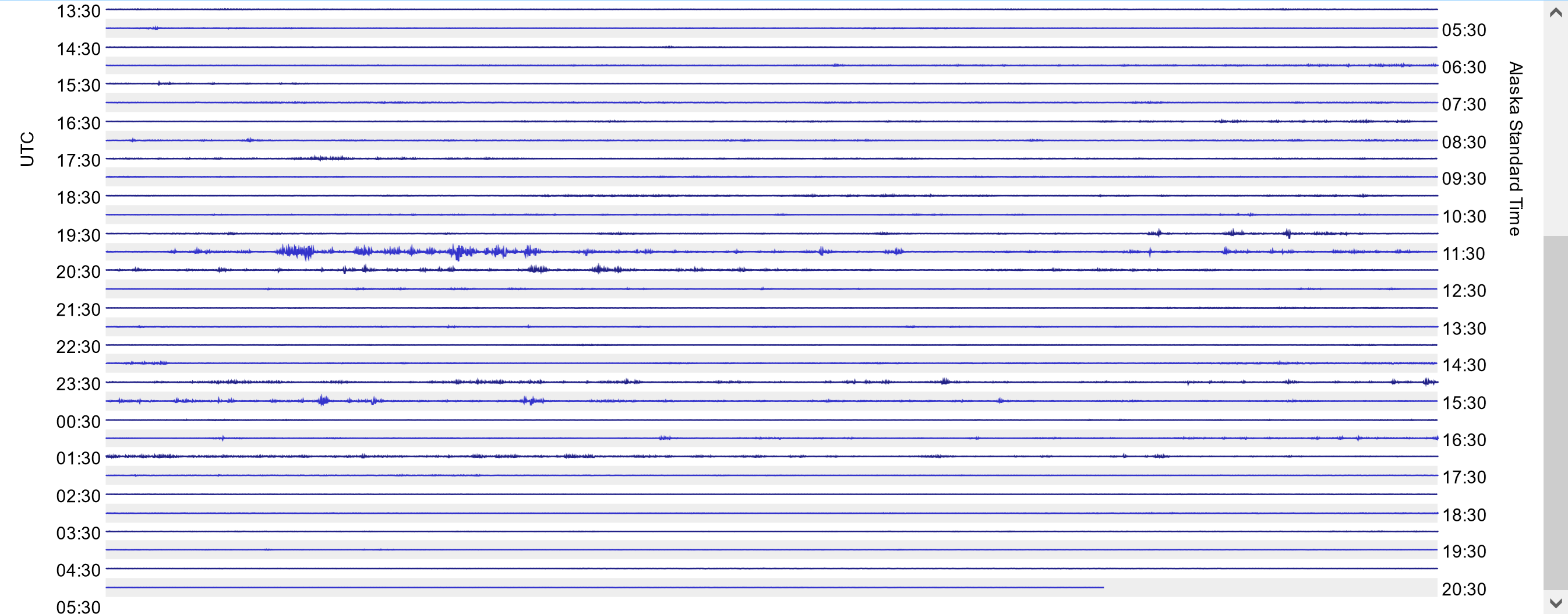
When looking at the live Data View here: Data View: Raspberry Shake Data Visualization Tool
the UTC scale on the left is 30 minutes different than the Local Time scale on the right. The UTC scale is correct.
When looking at the live Data View here: Data View: Raspberry Shake Data Visualization Tool
the UTC scale on the left is 30 minutes different than the Local Time scale on the right. The UTC scale is correct.
hi there,
it does seem confusing, but it’s actually correct:
change the setting to show 60 minutes on a single line and it will be more obvious that the labels are every other line, the opposite line for each side.
cheers,
richard
That makes sense now. Yes, it is confusing. I think the scales should be aligned.