We want to understand the units on the data. The time series data shows a y-axis named “PA”. We believe this refers to Pascals. The problems are that the standard reference to Pascals is “Pa.” Also confusing is if we mouse over the box at the top of the daily data saying PA, it says something like atmospheric pressure. We believe it really means Pascal but we are hoping for clarification.
Likewise, when we look at “FFT” the y-axis is labelled “amplitude” which is not a meaningful term. We believe it refers in this case to atmospheres. The typical numbers are like 10^-6, which equates to 0.1 Pascals (one atm = 10^5 Pa). Is this correct?
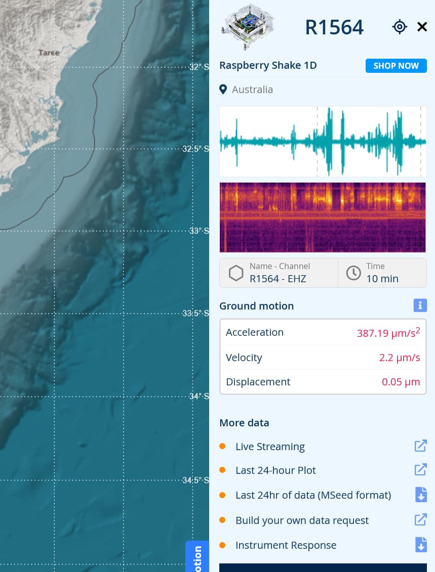
I assume you are referring to Data View and particularly the HDF channel for Raspberry Shake and Booms.
You are correct, the HDF channel is displayed in Pascals once the instrument response is applied to the signal, and the correct abbreviation is Pa. The Y axis label can be clicked to toggle between PA(sic) and Counts. The PA(sic) in the header when you mouse over it displays “Units in Atmospheric Pressure”. This is just a reminder that if you are comparing the signal strength to atmospheric pressure you need to know the atmospheric pressure in Pascals (not mmHg, etc).
Incidentally, the Boom does not measure atmospheric pressure. It measures vibrations or deviations away from atmospheric pressure. So you can think of the zero line on the HDF waveform as being the atmospheric pressure. It doesn’t matter what the atmospheric pressure actually is as far as the Boom is concerned (it may be 101.3kPa or 990kPa or something else), the Boom is only looking for the vibrations in the atmosphere regardless of atmospheric pressure.
I assume the “FFT” you refer to is the PSD plot - Power Spectral Density. The units for PSDs are Watts per bandwidth, or W/Hz. So this not directly related to Pascals. Power Spectral Density plots tend to be used to characterize and compare broadband random signals, like earthquakes or infrasound. A Fast Fourier Transform (FFT) plot is usually used for signals that are not so random and/or broadband (though they could be) such as in vibration analysis of machines. An FFT is used in the process of constructing a PSD, as more information is added to the FFT to make a PSD. Each has pros and cons compared to the other, depending on what you are looking for.
The Amplitude label on the y axis of the PSD is confusing if it is a true PSD (i.e. units W/Hz), however it may make sense if the true units plotted in this PSD is Pa/hz. That would mean the area under the PSD curve adds up the area between the waveform and the X axis (when displayed in Pa) for the sample period the PSD is plotted from. It would be nice if @Stormchaser or someone from Raspberry Shake could clarify this.
Regarding the PSD plot, I’ve just found another reference that may shed some light on the units.
It may be that the units for the HDF PSD are Pa²/Hz, not W/Hz as I mentioned above. It seems that for electrical signals, these are converted to W/Hz, but for other signals it is the amplitude squared divided by the bandwidth of the frequency interval (resolution).
Though it would still be nice to get official confirmation of the PSD units from Raspberry Shake!
Thank you Sheeny, If it is PSD, Pa^2/Hz, that would answer the question. But let’s see if we can get confirmation. I would still like to go back to the time series to make sure it is consistent with that.
Hello again. I forgot to mention that as far as I know the usual units of PSD are decibels. The units I am seeing when I “toggle spectrum” are 10^-5 or 10^-6 which is clearly not dB.
Correct. The PSD is presented on a logarithmic scale so the numerical value is the value of the pure PSD. dB are plotted on a linear scale, but the logarithmic equation for dB includes the logarithm of the raw PSD. The curve shapes should be the same.
Thanks again! I think this concludes the discussion of these units, which brings me to the next question: My knowledge of digital data processing is somewhat limited, and I don’t understand counts. Can you please explain? And, how are they related to Pa in this case? Is there a one-to-one correlation between counts and Pa?
Counts are a product of the sensor and the analog to digital (A/D) converter used to change the analog signal from the sensor to a digital figure that a computer can handle.
The A/D converter will have a range and a resolution. The resolution can’t be changed, so it might be 65536 (2^16) say for a 16 bit A/D converter. If the A/D converter is set up for full range of say 4 Pa, then one count would be 0.00006103516 Pa. This is NOT an actual figure for the Boom - it’s just an example to explain how it works. ;o)
The analog sensor output may not be linear, so there may be other coefficients applied to convert the number of counts to the final units (in the case of the Boom that is Pa).
All the data required for converting the number of counts to the final units is included in the instrument response file. You can view the instrument response file for your shake by going to the My Shake page and clicking on the MetaData button. The file is in .XML format.
For Shakes other than your own, the response file is available from Station View. Select the station you are interested in, and on the right hand side of the page you should see a download button for the Instrument Response.
What an amazing and interesting conversation in this topic! Thank you both sheeny and safric (and welcome to the community!).
I have passed your notification to our website team, and they will correct the PA into Pa as soon as possible.
Also, if you require more information about counts, you can read this very useful page from the EarthScope Consortium: NSF SAGE: Frequently Answered Question and have a sample on how to convert counts to metric units or Decibels using Python here: Developer’s corner
I am still confused about the units in the PSD files. Can we get a confirmation that it is Pa^2/Hz. When taking dB there has to be a reference value. Is is 1 Pa here?
However, other references I found simply say the PSD decibels are calculated as 10*log(P), where P is the PSD array in real units. I had a look into the code in Matplotlib.axes.psd and this certainly seems to be what Matplotlib does.
I’d still like to hear from the Raspberry Shake team as to what they are using… just to be sure. ;o)
Thanks so much for your typically thoughtful response.
First, to go back to units. I at one time considered whether the data presented were referenced Sound Pressure Level SPL, relative to 20 micropascals but I didn’t think so. This unit would be most relevant to anthropomorphic audio perception. Rather, I believe it is Power Spectral Density PSD re 1Pa^2/Hz. This measure is often converted to dB but the values on the graphs (not in dB) look right to me given the levels on the time series, averaged perhaps as the signals are not present through the entirely of the samples used to compute PSD.
By the way, I should point out that the natural atmospheric backgrounds are large! For example, microbaroms, which are very often present, have typical levels of, around, 0.2Pa. If this were in the audio range, it would be around 80 dB SPL, the equivalent of the sound of a freight train at about 100 ft. If we could hear this most of the time it would be very distracting. I believe that evolution has protected us from this noise by cutting off our hearing around 20 Hz.
I have received a reply from our team (apologies for the delay) and here it is:
The unit of measure of that specific plot depends on the sensor. The gain unit that is displayed is the one in the channel metadata. It is also written in the data plot Y-axis and at the top of the helicorder for that specific channel.
The amplitude vs. frequency plot is called a spectrum, and what we display is the power spectrum. It is actually the magnitude from the normalized FFT: sqrt(real * real + imag * imag). The plot is taking the data as received by the sensor and thus plots the curve with with the gain applied. That’s it.
Here is the relevant code for your reference:
const spectrum = fft(data);
const powerSpectrumLength = Math.floor(spectrum.length / 2) - 1;
const powerSpectrum = new Array<DataSample>(powerSpectrumLength);
const fNyquist = rec.samplingRate() * 0.5;
const df = fNyquist / powerSpectrumLength;
const norm = 1.0 / item.gain / rec.samplingRate(); // 1/gain * 1/f = dt/gain
let f = df;

for ( let i = 0; i < powerSpectrumLength; ++i, f += df ) {
    // Skip offset, f = 0
    const sr = spectrum[2 * i + 2] * norm;
    const si = spectrum[2 * i + 3] * norm;
    powerSpectrum[i] = [f, Math.sqrt(sr * sr + si * si)];
}
If there is anything else, please feel free to ask.
Well that’s very interesting! I expected it to be close to the code used by Matplotlib. At first glance it looks like the square root of what Matplotlib would produce… I’d need to code them side by side I think to see the difference.
    @_preprocess_data(replace_names=["x"])
    @_docstring.dedent_interpd
    def psd(self, x, NFFT=None, Fs=None, Fc=None, detrend=None,
            window=None, noverlap=None, pad_to=None,
            sides=None, scale_by_freq=None, return_line=None, **kwargs):
        r"""
        Plot the power spectral density.

        The power spectral density :math:`P_{xx}` by Welch's average
        periodogram method.  The vector *x* is divided into *NFFT* length
        segments.  Each segment is detrended by function *detrend* and
        windowed by function *window*.  *noverlap* gives the length of
        the overlap between segments.  The :math:`|\mathrm{fft}(i)|^2`
        of each segment :math:`i` are averaged to compute :math:`P_{xx}`,
        with a scaling to correct for power loss due to windowing.

        If len(*x*) < *NFFT*, it will be zero padded to *NFFT*.

        Parameters
        ----------
        x : 1-D array or sequence
            Array or sequence containing the data

        %(Spectral)s

        %(PSD)s

        noverlap : int, default: 0 (no overlap)
            The number of points of overlap between segments.

        Fc : int, default: 0
            The center frequency of *x*, which offsets the x extents of the
            plot to reflect the frequency range used when a signal is acquired
            and then filtered and downsampled to baseband.

        return_line : bool, default: False
            Whether to include the line object plotted in the returned values.

        Returns
        -------
        Pxx : 1-D array
            The values for the power spectrum :math:`P_{xx}` before scaling
            (real valued).

        freqs : 1-D array
            The frequencies corresponding to the elements in *Pxx*.

        line : `~matplotlib.lines.Line2D`
            The line created by this function.
            Only returned if *return_line* is True.

        Other Parameters
        ----------------
        data : indexable object, optional
            DATA_PARAMETER_PLACEHOLDER

        **kwargs
            Keyword arguments control the `.Line2D` properties:

            %(Line2D:kwdoc)s

        See Also
        --------
        specgram
            Differs in the default overlap; in not returning the mean of the
            segment periodograms; in returning the times of the segments; and
            in plotting a colormap instead of a line.
        magnitude_spectrum
            Plots the magnitude spectrum.
        csd
            Plots the spectral density between two signals.

        Notes
        -----
        For plotting, the power is plotted as
        :math:`10\log_{10}(P_{xx})` for decibels, though *Pxx* itself
        is returned.

        References
        ----------
        Bendat & Piersol -- Random Data: Analysis and Measurement Procedures,
        John Wiley & Sons (1986)
        """
        if Fc is None:
            Fc = 0

        pxx, freqs = mlab.psd(x=x, NFFT=NFFT, Fs=Fs, detrend=detrend,
                              window=window, noverlap=noverlap, pad_to=pad_to,
                              sides=sides, scale_by_freq=scale_by_freq)
        freqs += Fc

        if scale_by_freq in (None, True):
            psd_units = 'dB/Hz'
        else:
            psd_units = 'dB'

        line = self.plot(freqs, 10 * np.log10(pxx), **kwargs)
        self.set_xlabel('Frequency')
        self.set_ylabel('Power Spectral Density (%s)' % psd_units)
        self.grid(True)

        vmin, vmax = self.get_ybound()
        step = max(10 * int(np.log10(vmax - vmin)), 1)
        ticks = np.arange(math.floor(vmin), math.ceil(vmax) + 1, step)
        self.set_yticks(ticks)

        if return_line is None or not return_line:
            return pxx, freqs
        else:
            return pxx, freqs, line