My current Python Report for code examples

I’ve had a lot of help from people as I learned to code this report in Python and I’ve had some interest expressed in my report, so here it is, warts and all, for free use and modification or simply as code examples.

This has been my excuse and motivation to learn Python. It has evolved as I’ve learned and added new things, so it’s probably not a great example of how to write python code, but the bits that make it up might help someone else on their coding journey.

This is what the resulting report looks like:

That is with ‘All’ phases selected to display in the ray path plot.

It can also look like this:

This is with only the phases that arrive in the time window of the displayed traces displayed in the ray path plot.

I have also recently added Cartopy, and the ability to produce a simple Nearside Perspective map to show the station and earthquake locations and the great circle path between, which looks like this:

Here is the code from my report:


from obspy.clients.fdsn import Client
from obspy.core import UTCDateTime
from obspy.signal import filter
import matplotlib.pyplot as plt
from matplotlib.ticker import AutoMinorLocator
import numpy as np
from obspy.taup import TauPyModel
import math
import cartopy.crs as ccrs
import cartopy.feature as cfeature
rs = Client('RASPISHAKE')

def plot_arrivals(ax):
    y1 = -1
    axb, axt = ax.get_ylim()               # calculate the y limits of the graph
    for q in range(0, no_arrs):            #plot each arrival in turn
        x1 = arrs[q].time              # extract the time to plot
        if (x1 >= delay):
            if x1 < delay+duration:
                ax.axvline(x=x1, linewidth=0.5, linestyle='--', color='black')      # draw a vertical line
                if y1 < 0 or y1 < axt/2:                      # alternate top and bottom for phase tags
                    y1 = axt*0.8
                else:
                    y1 = axb*0.95
                ax.text(x1,y1,arrs[q].name, alpha=0.5)                                 # print the phase name

def time2UTC(a):        #convert time (seconds) since event back to UTCDateTime
    return eventTime + a

def uTC2time(a):        #convert UTCDateTime to seconds since the event
    return a - eventTime

def one_over(a):            # 1/x to convert frequency to period
    #Vectorized 1/a, treating a==0 manually
    a = np.array(a).astype(float)
    near_zero = np.isclose(a, 0)
    a[near_zero] = np.inf
    a[~near_zero] = 1 / a[~near_zero]
    return a

inverse = one_over          #function 1/x is its own inverse

def plot_noiselims(ax, uplim, downlim):
    axl, axr = ax.get_xlim()
    ax.axhline(y=uplim, lw=0.33, color='r', linestyle='dotted')     #plot +1 SD
    ax.axhline(y=uplim*2, lw=0.33, color='r', linestyle='dotted')     #plot +2 SD
    ax.axhline(y=uplim*3, lw=0.33, color='r', linestyle='dotted')     #plot upper background noise limit +3SD
    ax.axhline(y=downlim, lw=0.33, color='r', linestyle='dotted')   #plot -1 SD
    ax.axhline(y=downlim*2, lw=0.33, color='r', linestyle='dotted')   #plot -2SD
    ax.axhline(y=downlim*3, lw=0.33, color='r', linestyle='dotted')   #plot lower background noise limit -3SD
    ax.text(axl, uplim*3,'3SD background', size='xx-small', color='r',alpha=0.5, ha='left', va='bottom')
    ax.text(axl, downlim*3, '-3SD background', size='xx-small', color='r', alpha=0.5, ha='left', va='top')

def plot_se_noiselims(ax, uplim):
    axl, axr = ax.get_xlim()
    ax.axhline(y=uplim, lw=0.33, color='r', linestyle='dotted')     #plot +1 SD
    ax.axhline(y=uplim*2*2, lw=0.33, color='r', linestyle='dotted')     #plot +2 SD
    ax.axhline(y=uplim*3*3, lw=0.33, color='r', linestyle='dotted')     #plot upper background noise limit +3SD
    ax.axhline(y=0, lw=0.33, color='r', linestyle='dotted')         #plot 0 limit in case data has no zero
    ax.text(axl, uplim*3*3,'3SD background', size='xx-small', color='r',alpha=0.5, ha='left', va='bottom')

def divTrace(tr, n):            #divide trace into n equal parts for background noise determination
    return tr.__div__(n)

# set the station name and download the response information
stn = 'R21C0'                            # your station name
inv = rs.get_stations(network='AM', station=stn, level='RESP')  # get the instrument response
latS = -33.7691     #station latitude
lonS = 149.8843     #station longitude
eleS = 1114         #station elevation

#enter event data
eventTime = UTCDateTime(2022, 11, 6, 0, 3, 26) # (YYYY, m, d, H, M, S) **** Enter data****
latE = 3.7                           # quake latitude + N -S **** Enter data****
lonE = 123.2                          # quake longitude + E - W **** Enter data****
depth = 500                             # quake depth, km **** Enter data****
mag = 5.2                              # quake magnitude **** Enter data****
eventID = 'rs2022vvfmxs'               # ID for the event **** Enter data****
locE = "Celebes Sea"                # location name **** Enter data****

#set plot s29tart time
delay = 120                     # delay the start of the plot from the event **** Enter data****
duration = 900                  # duration of plots **** Enter data****
start = eventTime + delay       # calculate the plot start time from the event and delay
end = start + duration               # calculate the end time from the start and duration

#set background noise sample times (choose a section of minimum velocity amplitude to represent background noise)
bnstart = eventTime - 900                 # enter time of start of background noise sample (default = 0) **** Enter data****
bnend = eventTime + 600               # enter time of end of background noise sample (default = 600) **** Enter data****

# bandpass filter - select to suit system noise and range of quake
filt = [0.7, 0.7, 2, 2.1]       #distant quake
#filt = [0.7, 0.7, 6, 6.1]
#filt = [0.7, 0.7, 8, 8.1]
#filt = [1, 1, 10, 10.1]
#filt = [1, 1, 20, 20.1]        #use for local quakes

# set the FDSN server location and channel names
ch = 'EHZ' # ENx = accelerometer channels; EHx or SHZ = geophone channels

# get waveform and copy it for independent removal of instrument response
trace0 = rs.get_waveforms('AM', stn, '00', ch, start, end)
trace0.merge(method=0, fill_value='latest')         #fill in any gaps in the data to prevent a crash
trace0.detrend(type='demean')                       #demean the data
trace1 = trace0.copy()
trace2 = trace0.copy()

#get waveform for background noise and copy it for independent removal of instrument response
bn0 = rs.get_waveforms('AM', stn, '00', ch, bnstart, bnend)
bn0.merge(method=0, fill_value='latest')         #fill in any gaps in the data to prevent a crash
bn0.detrend(type='demean')                       #demean the data
bn1 = bn0.copy()
bn2 = bn0.copy()

# calculate great circle angle of separation
# convert angles to radians
latSrad = math.radians(latS)
lonSrad = math.radians(lonS)
latErad = math.radians(latE)
lonErad = math.radians(lonE)

if lonSrad > lonErad:
    lon_diff = lonSrad - lonErad
else:
    lon_diff = lonErad - lonSrad

great_angle_rad = math.acos(math.sin(latErad)*math.sin(latSrad)+math.cos(latErad)*math.cos(latSrad)*math.cos(lon_diff))
great_angle_deg = math.degrees(great_angle_rad)     #great circle angle between quake and station
distance = great_angle_rad*12742/2      #calculate distance between quake and station in km

#Calculate the Phase Arrivals
model = TauPyModel(model='iasp91')
arrs = model.get_travel_times(depth, great_angle_deg)
print(arrs)             # print the arrivals for reference when setting delay and duration
no_arrs = len(arrs)     # the number of arrivals

#calculate Rayleigh Wave arrival Time
rayt = distance/2.96

# Create output traces
outdisp = trace0.remove_response(inventory=inv,pre_filt=filt,output='DISP',water_level=60, plot=False) # convert to Disp
outvel = trace1.remove_response(inventory=inv,pre_filt=filt,output='VEL',water_level=60, plot=False) # convert to Vel
outacc = trace2.remove_response(inventory=inv,pre_filt=filt,output='ACC',water_level=60, plot=False) # convert to Acc

#Calculate maximums
disp_max = outdisp[0].max()
vel_max = outvel[0].max()
acc_max = outacc[0].max()
se_max = vel_max*vel_max/2

#Create background noise traces
bndisp = bn0.remove_response(inventory=inv,pre_filt=filt,output='DISP',water_level=60, plot=False) # convert to Disp
bnvel = bn1.remove_response(inventory=inv,pre_filt=filt,output='VEL',water_level=60, plot=False) # convert to Vel
bnacc = bn2.remove_response(inventory=inv,pre_filt=filt,output='ACC',water_level=60, plot=False) # convert to Acc

# Calculate background noise limits using standard deviation
bns = int((bnend - bnstart)/15)         #calculate the number of 15s samples in the background noise traces
bnd = divTrace(bndisp[0],bns)           #divide the displacement background noise trace into equal traces
bnv = divTrace(bnvel[0],bns)            #divide the velocity background noise trace into equal traces
bna = divTrace(bnacc[0],bns)            #divide the acceleration background noise trace into equal traces
for j in range (0, bns):                #find the sample interval with the minimum background noise amplitude
    if j == 0:
        bndispstd = abs(bnd[j].std())
        bnvelstd = abs(bnv[j].std())
        bnaccstd = abs(bna[j].std())
    elif abs(bnd[j].std()) < bndispstd:
        bndispmax = abs(bnd[0].max())
    elif abs(bnv[j].std()) < bnvelstd:
        bnvelstd = abs(bnv[j].std())
    elif abs(bna[j].max()) < bnaccstd:
        bnaccstd = abs(bna[j].std())
bnsestd = bnvelstd*bnvelstd/2           #calculate the max background noise level for the specific energy

# Create Signal Envelopes
disp_env = filter.envelope(outdisp[0].data)     #create displacement envelope
vel_env = filter.envelope(outvel[0].data)       #create velocity envelope
acc_env = filter.envelope(outacc[0].data)       #create acceleration envelope
#se_env=filter.envelope(outvel[0].data*outvel[0].data/2) #create specific energy envelope - comment out undesired method.
se_env=vel_env*vel_env/2                        #create specific energy envelope from velocity envelope! - comment out undesired method.

#plot map
plot_map = True
if plot_map:
    latC = (latE+latS)/2        #latitude 1/2 way between station and event/earthquake - may need adjusting!
    lonC = (lonE+lonS)/2        #longitude 1/2 way between station and event/earthquake - may need adjusting!
    if abs(lonE-lonS) > 180:
        lonC = lonC + 180
    plt.figure(figsize=(12, 12))
    ax = plt.axes(projection=ccrs.NearsidePerspective(
                        central_latitude=latC,
                        central_longitude=lonC,
                        satellite_height=100000000.0))      #adjust satellite height to best display station and event/earthquake
    ax.coastlines(resolution='110m')
    ax.stock_img()
    # Create a feature for States/Admin 1 regions at 1:50m from Natural Earth to display state borders
    states_provinces = cfeature.NaturalEarthFeature(
        category='cultural',
        name='admin_1_states_provinces_lines',
        scale='50m',
        facecolor='none')
    ax.add_feature(states_provinces, edgecolor='gray')
    ax.gridlines()
    #plot station position on map
    plt.plot(lonS, latS,
         color='blue', marker='o', markersize=10,
         transform=ccrs.Geodetic(),
         )
    #plot event/earthquake position on map
    plt.plot(lonE, latE,
         color='red', marker='*', markersize=12,
         transform=ccrs.Geodetic(),
         )
    #plot dashed great circle line from event/earthquake to station
    plt.plot([lonS, lonE], [latS, latE],
         color='red', linewidth=2, linestyle='--', 
         transform=ccrs.Geodetic(),
         )
    #plt.savefig('E:\Pictures\Raspberry Shake and Boom\M'+str(mag)+'Quake '+locE+eventID+eventTime.strftime('%Y%m%d %H%M%S UTC Map.png'))   #comment this out till map is right
    plt.show()
    plt.close()     #close this figure so the next one can be created

# set up plot
fig = plt.figure(figsize=(20,12))       # set to page size in inches
ax1 = fig.add_subplot(6,2,1)            # displacement waveform
ax2 = fig.add_subplot(6,2,3)            # velocity Waveform
ax3 = fig.add_subplot(6,2,5)            # acceleration waveform
ax6 = fig.add_subplot(6,2,7)            # specific energy waveform 
ax4 = fig.add_subplot(6,2,9)            # velocity spectrogram
ax5 = fig.add_subplot(6,2,11)            # velocity PSD
ax7 = fig.add_subplot(6,2,(2,10), polar=True)       # TAUp plot
fig.suptitle("M"+str(mag)+" Earthquake - "+locE+" - "+eventTime.strftime(' %d/%m/%Y %H:%M:%S UTC'), weight='black', color='b', size='x-large')      #Title of the figure
fig.text(0.05, 0.95, "Filter: "+str(filt[1])+" to "+str(filt[2])+"Hz")          # Filter details
fig.text(0.2, 0.95, 'Separation = '+str(round(great_angle_deg,3))+u"\N{DEGREE SIGN}"+' or '+str(int(distance))+'km.')   #distance between quake and station
fig.text(0.4, 0.95, 'Latitude: '+str(latE)+u"\N{DEGREE SIGN}"+' Longitude: '+str(lonE)+u"\N{DEGREE SIGN}"+' Depth: '+str(depth)+'km.')  #quake lat, lon and depth
fig.text(0.7, 0.95, 'Event ID: '+eventID)
fig.text(0.98, 0.95, 'Station: AM.'+stn+'.00.'+ch, ha='right')
fig.text(0.98, 0.935, 'Raspberry Shake and Boom', color='r', ha='right', size='small')
fig.text(0.98, 0.92, '@AlanSheehan18', ha='right', size='small')
fig.text(0.98, 0.905, '@raspishake', ha='right', size='small')
fig.text(0.98, 0.89, '#ShakeNet', ha='right', size='small')
fig.text(0.98, 0.875, '#CitizenScience', ha='right', size='small')
fig.text(0.98, 0.86, '#Python', ha='right', size='small')
fig.text(0.98, 0.845, '#MatPlotLib', ha='right', size='small')
fig.text(0.98, 0.83, '#Obspy', ha='right', size='small')
fig.text(0.96, 0.32, 'NOTES: ', rotation=90)                 # add any notes about the report **** Enter data****
fig.text(0.97, 0.32, '', rotation=90)                 # add any notes about the report **** Enter data****
fig.text(0.98, 0.32, '', rotation=90)                 # add any notes about the report **** Enter data****
fig.text(0.48, 0.715, 'Energy is', size='x-small',rotation=90, va='center')
fig.text(0.485, 0.715, 'proportional to V²', size='x-small',rotation=90, va='center')
fig.text(0.48, 0.87, 'Displacement biases', size='x-small',rotation=90, va='center')
fig.text(0.485, 0.87, 'low frequencies', size='x-small',rotation=90, va='center')
fig.text(0.48, 0.56, 'Acceleration biases', size='x-small',rotation=90, va='center')
fig.text(0.485, 0.56, 'high frequencies', size='x-small',rotation=90, va='center')
fig.text(0.48, 0.41, 'E/m = v²/2', size='x-small',rotation=90, va='center')
fig.text(0.485, 0.41, 'For weak arrivals', size='x-small',rotation=90, va='center')
fig.text(0.49, 0.87, 'Max D = '+f"{disp_max:.3E}"+' m', size='small',rotation=90, va='center',color='b')
fig.text(0.49, 0.715, 'Max V = '+f"{vel_max:.3E}"+' m/s', size='small',rotation=90, va='center',color='g')
fig.text(0.49, 0.56, 'Max A = '+f"{acc_max:.3E}"+' m/s²', size='small',rotation=90, va='center',color='r')
fig.text(0.49, 0.41, 'Max SE = '+f"{se_max:.3E}"+' J/kg', size='small',rotation=90, va='center',color='g')

#plot traces
ax1.plot(trace0[0].times(reftime=eventTime), outdisp[0].data, lw=1, color='b')      # displacement waveform
ax1.xaxis.set_minor_locator(AutoMinorLocator(10))
#ax1.set_ylim(-2e-7,2e-7)         # set manual y limits for displacement- comment this out for autoscaling
ax2.plot(trace0[0].times(reftime=eventTime), outvel[0].data, lw=1, color='g')       # velocity Waveform
ax2.xaxis.set_minor_locator(AutoMinorLocator(10))
#ax2.set_ylim(-1e-7,1e-7)         # set manual y limits for velocity - comment this out for autoscaling
ax3.plot(trace0[0].times(reftime=eventTime), outacc[0].data, lw=1, color='r')       # acceleration waveform
ax3.xaxis.set_minor_locator(AutoMinorLocator(10))
#ax3.set_ylim(-1e-6,1e-6)         # set manual y limits for acceleration - comment this out for auto scaling
ax4.specgram(x=trace1[0], NFFT=32, noverlap=2, Fs=100, cmap='viridis')         # velocity spectrogram
ax4.xaxis.set_minor_locator(AutoMinorLocator(10))
#ax4.set_yscale('log')               # set logarithmic y scale - comment this out for linear scale
#ax4.set_ylim(0,10)
#ax4.set_ylim(0,filt[3])            # limit y axis to the filter range - comment this out for full 50Hz
ax5.psd(x=trace1[0], NFFT=duration, noverlap=0, Fs=100, color='g', lw=1)             # velocity PSD
ax5.set_xscale('log')               #use logarithmic scale on PSD
ax6.plot(trace0[0].times(reftime=eventTime), outvel[0].data*outvel[0].data/2, lw=1, color='g')  #specific Energy Waveform
ax6.xaxis.set_minor_locator(AutoMinorLocator(10))
#ax6.set_ylim(0,1e-14)         # set manual y limits for energy - comment this out for autoscaling

#plot background noise limits
plot_noiselims(ax1, bndispstd, -bndispstd)      #displacement noise limits - comment out if not desired
plot_noiselims(ax2, bnvelstd, -bnvelstd)        #velocity noise limits - comment out if not desired
plot_noiselims(ax3, bnaccstd, -bnaccstd)        #acceleration noise limits - comment out if not desired
plot_se_noiselims(ax6, bnsestd)                 #specific energy noise limits - comment out if not desired

# plot Signal envelopes
plot_envelopes = False
if plot_envelopes:
    ax1.plot(trace0[0].times(reftime=eventTime), disp_env, 'b:')    #displacement envelope
    ax2.plot(trace0[0].times(reftime=eventTime), vel_env, 'g:')     #velocity envelope
    ax3.plot(trace0[0].times(reftime=eventTime), acc_env, 'r:')     #acceleration envelope
    ax6.plot(trace0[0].times(reftime=eventTime), se_env, 'g:')      #specific energy envelope

#plot secondary axes - set time interval (dt) based on the duration to avoid crowding
if duration <= 90:
    dt=10           #10 seconds
elif duration <= 180:
    dt=20           #20 seconds
elif duration <= 270:
    dt=30           #30 seconds
elif duration <= 540:
    dt=60           #1 minute
elif duration <= 1080:
    dt=120          #2 minutes
elif duration <= 2160:
    dt=240          #4 minutes
else:
    dt=300          #5 minutes
tbase = start - start.second +(int(start.second/dt)+1)*dt       #find the first time tick
tlabels = []            #initialise a blank array of time labels
tticks = []             #initialise a blank array of time ticks
sticks = []           #initialise a blank array for spectrogram ticks
nticks = int(duration/dt)       #calculate the number of ticks
for k in range (0, nticks):
    if dt >= 60:                #build the array of time labels - include UTC to eliminate the axis label
        tlabels.append((tbase+k*dt).strftime('%H:%M UTC'))      #drop the seconds if not required for readability
    else:
        tlabels.append((tbase+k*dt).strftime('%H:%M:%SUTC'))    #include seconds where required
    tticks.append(uTC2time(tbase+k*dt))                         #build the array of time ticks
    sticks.append(uTC2time(tbase+k*dt)-delay)                   #build the array of time ticks for the spectrogram
print(tlabels)                  #print the time labels - just a check for development
print(tticks)                   #print the time ticks - just a  check for development
secax_x1 = ax1.secondary_xaxis('top')       #Displacement secondary axis
secax_x1.set_xticks(ticks=tticks)
secax_x1.set_xticklabels(tlabels, size='small', va='center_baseline')
secax_x1.xaxis.set_minor_locator(AutoMinorLocator(10))
secax_x2 = ax2.secondary_xaxis('top')       #Velocity secondary axis
secax_x2.set_xticks(ticks=tticks)
secax_x2.set_xticklabels(tlabels, size='small', va='center_baseline')
secax_x2.xaxis.set_minor_locator(AutoMinorLocator(10))
secax_x3 = ax3.secondary_xaxis('top')       #acceleration secondary axis
secax_x3.set_xticks(ticks=tticks)
secax_x3.set_xticklabels(tlabels, size='small', va='center_baseline')
secax_x3.xaxis.set_minor_locator(AutoMinorLocator(10))
secax_x4 = ax4.secondary_xaxis('top')      #spectrogram secondary axis - not yet working
secax_x4.set_xticks(ticks=sticks)
secax_x4.set_xticklabels(tlabels, size='small', va='center_baseline')
secax_x6 = ax6.secondary_xaxis('top')       #Specific Energy secondary axis
secax_x6.set_xticks(ticks=tticks)
secax_x6.set_xticklabels(tlabels, size='small', va='center_baseline')
secax_x6.xaxis.set_minor_locator(AutoMinorLocator(10))
secax_x5 = ax5.secondary_xaxis('top', functions=(one_over, inverse))        #PSD secondary axis
secax_x5.set_xlabel('Period, s', size='small', alpha=0.5, labelpad=-3)

# build array of arrival data
x2 = 0.49        #start near middle of page but maximise list space
dx = 0.0066      # linespacing
fig.text(x2, 0.03, 'Phase',size='small', rotation=90)         #print headings
fig.text(x2, 0.09, 'Time',size='small', rotation=90)
fig.text(x2, 0.15, 'UTC',size='small', rotation=90)
fig.text(x2, 0.2, 'Vertical Component', alpha = 0.5, size='small', rotation=90)
pphases=[]          #create an array of phases to plot
pfile=''            #create phase names for filename
allphases=True    #true if all phases to be plotted, otherwise only those in the plotted time window are plotted **** Enter data****
alf=1.0          #set default transparency
for i in range (0, no_arrs):                    #print data array
    x2 += dx
    if arrs[i].time >= delay and arrs[i].time < (delay+duration):       #list entries in the plots are black
        alf=1.0
    else:                                                               #list entries not in plots are greyed out
        alf=0.5
    fig.text(x2, 0.03, arrs[i].name, size='small', rotation=90, alpha=alf)       #print phase name
    fig.text(x2, 0.09, str(round(arrs[i].time,3))+'s', size='small', rotation=90, alpha=alf)     #print arrival time
    arrtime = eventTime + arrs[i].time
    fig.text(x2, 0.15, arrtime.strftime('%H:%M:%S'), size='small', rotation=90, alpha=alf)
    if allphases or (arrs[i].time >= delay and arrs[i].time < (delay+duration)):      #build the array of phases
        pphases.append(arrs[i].name)
        pfile += ' '+arrs[i].name
    if arrs[i].name.endswith('P') or arrs[i].name.endswith('p') or arrs[i].name.endswith('Pdiff') or arrs[i].name.endswith('Pn'):                    #calculate and print the vertical component of the signal
        fig.text(x2, 0.2, str(round(100*math.cos(math.radians(arrs[i].incident_angle)),1))+'%', alpha = 0.5, size='small', rotation=90)
    elif arrs[i].name.endswith('S') or arrs[i].name.endswith('s') or arrs[i].name.endswith('Sn') or arrs[i].name.endswith('Sdiff'):
        fig.text(x2, 0.2, str(round(100*math.sin(math.radians(arrs[i].incident_angle)),1))+'%', alpha = 0.5, size='small', rotation=90)
x2 += 2*dx
fig.text(x2, 0.03, str(no_arrs)+' arrivals total.', size='small', rotation=90)     #print number of arrivals

print(pphases)      #print the phases to be plotted on ray path diagram

if allphases or (rayt >= delay and rayt <= (delay+duration)):
    x2 = 0.905-dx
    fig.text(x2, 0.03, 'Rayleigh Surface Wave Arrival: '+str(round(rayt,1))+'s:', size='small', rotation=90)
    arrtime = eventTime + rayt
    fig.text(x2, 0.23, arrtime.strftime('%H:%M:%S UTC'), size='small', rotation=90)
    
# print phase key
x2 = 0.91           # line spacing
fig.text(x2, 0.03, 'Phase Key', size='small', rotation=90)      #print heading
pkey = ['P:   compression wave', 'p:   strictly upward compression wave', 'S:   shear wave', 's:   strictly upward shear wave', 'K:   compression wave in outer core', 'I:   compression wave in inner core', 'c:   reflection off outer core', 'diff:   diffracted wave along core mantle boundary', 'i:   reflection off inner core', 'n:   wave follows the Moho (crust/mantle boundary)']
for i in range (0, 10):
    x2 +=dx
    fig.text(x2, 0.03, pkey[i], size='small', rotation=90)      #print the phase key

#plot phase arrivals
plot_arrivals(ax1)          #plot arrivals on displacement plot
plot_arrivals(ax2)          #plot arrivals on velocity plot
plot_arrivals(ax3)          #plot arrivals on acceleration plot
plot_arrivals(ax6)          #plot arrivals on energy plot

# set up some plot details
ax1.set_ylabel("Vertical Displacement, m", size='small')
ax1.set_xlabel('Seconds after Event, s', size='small', labelpad=0)
ax2.set_ylabel("Vertical Velocity, m/s", size ='small')
ax2.set_xlabel('Seconds after Event, s', size='small', labelpad=0)
ax3.set_ylabel("Vertical Acceleration, m/s²", size='small')         
ax3.set_xlabel('Seconds after Event, s', size='small', labelpad=0)
ax4.set_ylabel("Velocity Frequency, Hz", size='small')
ax4.set_xlabel('Seconds after Start of Trace, s', size='small', alpha=0.5, labelpad=-3)
ax5.set_ylabel("Velocity. PSD, dB",size='small')
ax5.set_xlabel('Frequency, Hz', size='small', labelpad=0)
ax6.set_ylabel('Specific Energy, J/kg', size='small')
ax6.set_xlabel('Seconds after Event, s', size='small', labelpad=0)

# get the limits of the y axis so text can be consistently placed
ax4b, ax4t = ax4.get_ylim()
ax4.text(2, ax4t*0.85, 'Plot Start Time: '+start.strftime(' %d/%m/%Y %H:%M:%S.%f UTC (')+str(delay)+' seconds after event).', size='small')      # explain difference in x time scale

#adjust subplots for readability
plt.subplots_adjust(hspace=0.6, wspace=0.1, left=0.05, right=0.95, bottom=0.05, top=0.92)

#plot the ray paths
arrivals = model.get_ray_paths(depth, great_angle_deg, phase_list=pphases)      #calculate the ray paths
ax7 = arrivals.plot_rays(plot_type='spherical', ax=ax7, fig=fig, phase_list=pphases, show=False, legend=True)   #plot the ray paths
if allphases:
    ax7.text(math.radians(315), 4800, 'Show All Phases', ha='center', va='center', alpha=.7, size='small')
else:
    ax7.text(math.radians(315), 4800, 'Show Phases Visible in Traces', ha='center', va='center', alpha=.7, size='small')
if great_angle_deg > 103 and great_angle_deg < 143:
    ax7.text(great_angle_rad,6800, 'Station in P and\nS wave shadow', size='x-small', rotation=180-great_angle_deg, ha='center', va='center')
elif great_angle_deg >143:
    ax7.text(great_angle_rad,6800, 'Station in S\nwave shadow', size='x-small', rotation=180-great_angle_deg, ha='center', va='center')

# Annotate regions
ax7.text(0, 0, 'Solid\ninner\ncore',
        horizontalalignment='center', verticalalignment='center',
        bbox=dict(facecolor='white', edgecolor='none', alpha=0.7))
ocr = (model.model.radius_of_planet -
       (model.model.s_mod.v_mod.iocb_depth +
        model.model.s_mod.v_mod.cmb_depth) / 2)
ax7.text(math.radians(180), ocr, 'Fluid outer core',
        horizontalalignment='center',
        bbox=dict(facecolor='white', edgecolor='none', alpha=0.7))
mr = model.model.radius_of_planet - model.model.s_mod.v_mod.cmb_depth / 2
ax7.text(math.radians(180), mr, 'Solid mantle',
        horizontalalignment='center',
        bbox=dict(facecolor='white', edgecolor='none', alpha=0.7))

#create phase identifier for filename
if allphases:
    pfile = ' All'

#print filename on bottom left corner of diagram
filename = 'E:\Pictures\Raspberry Shake and Boom\M'+str(mag)+'Quake '+locE+eventID+eventTime.strftime('%Y%m%d %H%M%S UTC'+pfile+'.png')
fig.text(0.02, 0.01,filename, size='x-small')

# save the final figure
#plt.savefig(filename)  #comment this line out till figure is final

# show the final figure
plt.show()

3 Likes

Some notes about the code and how I use it.

Earthquake Data
I use the ShakeNet Station View web app to get the data for the quake I’m interested in. (I also use EarthquakesGA and any other source I can find for aussie quakes that aren’t on RS). The quake/event data is entered into lines 72 to 79.

Station Data
Station data is in lines 65 to 70 and once setup doesn’t need to be changed unless you are changing the station you want to use.

Plot Timing
Immediately below the event data, I enter figures for a delay and duration. The delay is the number of seconds from the event (earthquake) time till the signal plots start. The duration is, of course how long the signal plot should run for.

Bandpass Filters
In line 91 to 96 are some bandpass filter settings. Initially I edited the filter corner figures to change the bandpass filter, but I’ve since got a few common filters I use set up on separate lines and simply comment out the ones I don’t want to use at the time.

Waveforms for Displacement, Velocity and Acceleration
In lines 101 to to 106, the program gets the waveform from the server and then makes two additional copies of it. This is so they can be processed into displacement, velocity and acceleration plots when the instrument response is removed.

Map
Lines 181 to 220 is where the map is plotted. Initially plot_map in line 182 is true, and the plt.savefig command in line 218 is commented out. This allows the map to be adjusted before saving the final version. Once the final version is saved, I comment out the plt.savefig command again ready for next time, and then set plot_map to false to skip all the mapping code for subsequent runs.

Plotting Traces
In the section where the traces are plotted (lines 261 to 280) there are several code lines commented out which can be uncommented to use. For example, there’s provision for manual y scaling on each plot so that strong noise in the plot can be clipped and the signal still be reasonably displayed.

Phase Arrival Array
Lines 347 to 376 is where an array of phase arrival data is constructed and plotted into the figure. This array includes the phase name, the arrival time in seconds after the earthquake, the arrival time in UTC and the vertical component of the signal as a percentage of the true signal. The vertical component is all that a Shake and Boom or 1D can detect, so knowing the vertical component allows some judgement about how much signal to expect from that phase. The allphases variable on line 356 is initially set to true to plot all the phase ray paths in the one diagram. I usually do this for the first figure, with a long duration of , say, 900 seconds. After that, I change allphases to false so only the path of the phases in the plot window are plotted.

Saving Final Figure Plot
At the end of the code (line 457 in fact) the plt.savefig command is commented out until the figure is final. When the command is uncommented the figure is saved using a standardised file name made up of the path, and the quake magnitude, location, time and the phases in the plot.

How I Use It
Initially I run the program to produce a plot of the map and the initial long duration plot (say 900s) with all phases displayed. I then set allphases to false to only display the ray paths of the phases in the plots for subsequent plots. If the filter is 0.7 to 2 Hz, I will usually change the plot_envelopes variable in line 289 to true to add envelopes to the waveforms. Envelopes can get messy with broad bandpass filters and long durations.

For the subsequent plots, I refer to the phase arrival times in the IPython Console of Spyder (or in the phases array on the previous figure) to change the delay and duration of the plots for each phase or group of phases. This gives a detailed plot of the arrival(s) for timing. As the core mantle boundary and inner outer core boundaries may be a different shape to the spherical model, the actual arrivals may be earlier or later than predicted.

Detecting Weak Signals
To help in detecting weak signals, background noise standard deviation lines are plotted on the waveform plots. These are calculated from the signal 900s before to 600s after the earthquake time so that temperature and other periodic effects on the Shake sensitivity are taking into account as well as local noise and noise from other earthquake signals. This is done by slicing the 900 + 600 = 1500 second signals into 15s long pieces and finding the minimum standard deviation for a 15s interval. This seems, by trial and error to be a reasonable fit for the base noise level. If this is not found to be the case, the time intervals can be adjusted to suit in lines 88 and 89 for the background noise start (bnstart) and end (bnend) and in line 157 where the background noise sample (bns) is calculated by dividing (bnend - bnstart) by 15 seconds.

Specific Energy Plot
The other thing I added to aid in detect weak signals was to calculate the Specific Energy signal from the velocity waveform. This is based on the formula E = mvv/2, so by squaring the velocity waveform and dividing by 2, the specific energy plot is obtained. The intent was that this would make weak signal more obvious, and it does to some extent, though perhaps it may benefit from plotting on the log y scale. What I have found is that specific energy often gives a very clear indication of arrival time.

3 Likes

Thanks for posting, This is usable.
I will also add my code here Marco

2 Likes

Thank you for sharing your detailed code with all the community sheeny!

I’m sure that it will be of great use to many that want to start (or improve) their data processing and visualization products!

Here my python code, thanks to Giuseppe and Steve for help.

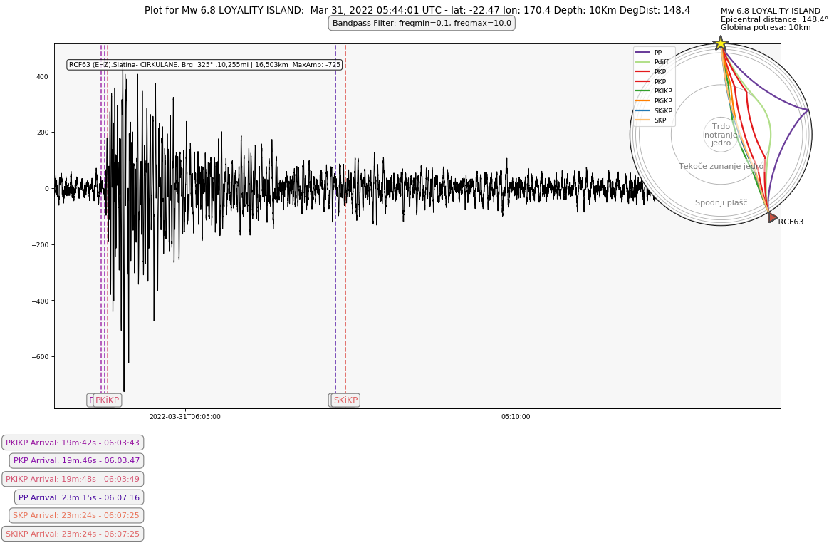
Displays data for a Single RaspberryShake stations

Options available:

Display all four 4D channels

Display phase arrival times

Display globe with phase arrivals

from datetime import timedelta
from obspy.clients.fdsn import Client
from obspy.taup import TauPyModel
from obspy import UTCDateTime, Stream
from obspy.geodetics import gps2dist_azimuth
from obspy.geodetics.base import locations2degrees
from matplotlib import cm
from numpy import linspace
import matplotlib.transforms as transforms
import matplotlib.pyplot as plt
import numpy as np

client = Client(‘http://fdsnws.raspberryshakedata.com’)

Information for the Event to Plot

LABEL = "Ml 3.5 HRVASKA " # Title to plot on figure
EVT_LAT = 45.40 # Latitude of event
EVT_LON = 16.32 # Longitude of event
EVT_LATLON = (EVT_LAT, EVT_LON)
EVT_TIME = “2022-11-07 09:21:31” # origin time of event
EVT_Z = 10 # Depth of event in km

RaspberryShake station settings

NETWORK = ‘AM’ # AM = RaspberryShake network
STATION = “RCF63” # Station code of local station to plot
STA_LAT = 46.341 # + for N, - for S
STA_LON = 15.970 # + for E, - for W
CHANNEL = ‘EHZ’ # RS Geophone Channel. 1D:SHZ - (50 sps Geophone), EHZ - (100 sps Geophone) 4D:EHZ
STA_LOCNAME = ‘Slatina- CIRKULANE’

DISTANCE=locations2degrees(EVT_LAT, EVT_LON, STA_LAT, STA_LON) # Station dist in degrees from epicentre

Waveform Plot settings (Customize as needed)

DURATION = 240 # Length in seconds of data to plot after origin time
TIMEOFFSET = 0 # Time to add before start of general plot to adust placement of the waveform
ARRIVAL_TIME_ADJUST = 00 # time to add for the delay of an arriving event. Used for distant/teleseismic events
F1L = 0.1 # Low frequency bandpass filer
F1H = 10.0 # High frequency bandpass filer
FIGSIZE_WAVE = 15, 8 # Figure size of the figure contaning the waveform/normal graph(s)
WAVEFORM_SIZE = 800, 500 # Individual wavefrom size
DPI = 80 # dpi for plot

Addtional Plotting options

PLOT_4D_ACCEL = False # If True, the the 4D acel. channels will plot with the EHZ channel
PLOT_PHASE_LINES = True # If True, phase lines will be added to the plot
PLOT_PHASE_GLOBE = False # If True, a globe with plotted phases will be added to the waveform. Best used with long distnce quakes.
PLOT_PS_ONLY = True # If True, only P and S waves will be plotted. Use False for distant quakes

Calculated constants

PHASES = [“P”, “pP”, “PP”, “S”, “Pdiff”, “PKP”, “PKIKP”, “PcP”, “ScP”, “ScS”,
“PKiKP”, “SKiKP”, “SKP”, “SKS”] # All phases. Good for distant quakes

if PLOT_PS_ONLY:
PHASES = [“P”, “S”] # Plot only S and P good for local quakes

EVT_TIME = UTCDateTime(EVT_TIME)
STARTTIME = EVT_TIME + ARRIVAL_TIME_ADJUST
ENDTIME = STARTTIME + DURATION
STA_DIST, _, BEARING = gps2dist_azimuth(STA_LAT, STA_LON, EVT_LAT, EVT_LON) # Station dist in m from epicenter
STA_DEGREES = locations2degrees(EVT_LAT, EVT_LON, float(STA_LAT), float(STA_LON))
CHANNEL_SET = [CHANNEL]
COLORS = [cm.plasma(x) for x in linspace(0, 0.7, len(PHASES))] # Colors from 0.8-1.0 are not very visible
DEG_DIST_TITLE = "Km DegDist: " + str(round(STA_DEGREES, 1))

EVT_TIME = EVT_TIME.strftime(’%b %d, %Y %H:%M:%S’)
MODEL = ‘iasp91’ # Velocity model to predict travel-times through

Intialize Other items

FILTERLABEL = “”
PHASE_PLOT_FILENAME = ‘’
ACCEL_PLOT_FILENAME = ‘’
GLOBE_PLOT_FILENAME = ‘’
maxamp = []

def nospaces(string):
out = “”
for n in string.upper():
if n in “ABCDEFGHIJKLMNOPQRSTUVWXYZ0123456789”:
out += n
else:
out += “_”
return out

def pad(num):
out = str(num)
while len(out) < 3:
out = “0” + out
return out

def convert(seconds):
seconds = seconds % (24 * 3600)
seconds %= 3600
minutes = seconds // 60
seconds %= 60
return “%02dm:%02ds” % (minutes, seconds)

#Get the waveform data

waveform = Stream() # set up a blank stream variable

if PLOT_4D_ACCEL:
CHANNEL_SET = [“EHZ”, “ENZ”, “ENN”, “ENE”]

for k, channel in enumerate(CHANNEL_SET):
try:
st = client.get_waveforms(‘AM’, STATION, ‘00’, channel, starttime=STARTTIME-TIMEOFFSET, endtime=ENDTIME)
st.merge(method=0, fill_value=‘latest’)
st.detrend(type=‘demean’)
st.filter(‘bandpass’, freqmin=F1L, freqmax=F1H)
FILTERLABEL = “Bandpass Filter: freqmin=” + str(F1L) + “, freqmax=” + str(F1H)
maxvalue = (st.max())
maxvalue = format(int(maxvalue[0]), ‘,d’)
maxamp.append(maxvalue)
waveform += st
except:
print(STATION, channel, “off line”)

Set the waveform stats info that displayes on wavefrom plot.

The configeration below will display as RXXXX (Channel).Location Name.Brg: XX. XXmi : xxkm MaxAmp :xxxx

for k, wave in enumerate(waveform):
waveform[k].stats.network = STATION + ’ (’ + CHANNEL_SET[k] +’)’
waveform[k].stats.station = STA_LOCNAME
waveform[k].stats.location = " Brg: " + str(round(BEARING))+ u"\N{DEGREE SIGN} "
waveform[k].stats.channel = str(format(int(STA_DIST/1000* 0.621371), ‘,d’)) + "mi | " + str(format(int(STA_DIST/1000), ‘,d’)) +"km MaxAmp: " + maxamp[k] # Distance in km

very big data sets may need to be decimated, otherwise the plotting routine crashes

if DURATION * len(waveform) > 6000:

waveform.decimate(10, strict_length=False, no_filter=True)

Plot the waveform

fig1 = plt.figure(figsize=(FIGSIZE_WAVE), dpi=DPI)

plt.title('Plot for ‘+LABEL+’: '+EVT_TIME+" UTC - lat: “+str(EVT_LAT)+” lon: “+str(EVT_LON) + " Depth: " + str(EVT_Z) + DEG_DIST_TITLE, fontsize=12, y=1.07)
plt.xticks([])
plt.yticks([])
waveform.plot(size=(WAVEFORM_SIZE), type=‘normal’, automerge=False, equal_scale=False, fig=fig1, handle=True, starttime=STARTTIME-TIMEOFFSET, endtime=ENDTIME-TIMEOFFSET, fontsize=10, bgcolor=”#F7F7F7")

if PLOT_PHASE_LINES: # Add the arrival times and vertical lines
plotted_arrivals = []
for j, color in enumerate(COLORS):
phase = PHASES[j]
model = TauPyModel(model=MODEL)
arrivals = model.get_travel_times(source_depth_in_km=EVT_Z, distance_in_degree=STA_DEGREES, phase_list=[phase])
printed = False
if arrivals:
for i in range(len(arrivals)):
instring = str(arrivals[i])
phaseline = instring.split(" “)
phasetime = float(phaseline[4])
arrivaltime = STARTTIME - timedelta(seconds=ARRIVAL_TIME_ADJUST) + timedelta(seconds=phasetime)
if phaseline[0] == phase and printed == False and (STARTTIME < arrivaltime < ENDTIME):
axvline_arrivaltime = np.datetime64(arrivaltime)
legend_arrivaltime = arrivaltime.strftime(”%H:%M:%S")
plotted_arrivals.append(tuple([round(float(phaseline[4]), 2), phaseline[0], legend_arrivaltime, color, axvline_arrivaltime]))
printed = True
if plotted_arrivals:
plotted_arrivals.sort(key=lambda tup: tup[0]) #sorts the arrivals to be plotted by arrival time
ax = fig1.gca()
trans = transforms.blended_transform_factory(ax.transData, ax.transAxes)

    if PLOT_4D_ACCEL:  #Plot the 4D accel channel wave forms
        axcheck = fig1.axes
        l = 0
        while l < (len(axcheck)-2):
            exec(   "ax" + str(l + 3) + " = plt.gcf().get_axes()[" + str(l + 1) +"]" )
            exec("trans" + str(l + 3) + " = transforms.blended_transform_factory(ax.transData, ax" + str(l + 3) + ".transAxes)")
            l += 1

    axcheck = fig1.axes
    phase_ypos = 0

    for phase_time, phase_name, arrival_legend, color_plot, arrival_vertline in plotted_arrivals:
        ax.vlines(arrival_vertline, ymin=0, ymax=1, alpha=.80, color=color_plot, ls='--', zorder=1, transform=trans)
        plt.text(arrival_vertline, .015, phase_name, c=color_plot, fontsize=11, transform=trans, horizontalalignment='center', zorder=1, bbox=dict(boxstyle="round", facecolor='#f2f2f2', ec="0.5", pad=0.24, alpha=1))
        if PLOT_4D_ACCEL:
            l = 0
            while l < (len(axcheck)-2):
                counter = str(l + 3)
                exec("ax" + counter + ".vlines(arrival_vertline, ymin=0, ymax=1, alpha= .80 , color=color_plot,ls='--', zorder=1, transform=trans" + counter + ")")
               # exec("plt.text(arrival_vertline, .015, phase_name,c=color_plot, fontsize=11, transform=trans" + counter + ", horizontalalignment='center', zorder=1,bbox=dict(boxstyle='round', facecolor='#f2f2f2', ec='0.5', pad=0.24, alpha=1))")
                l += 1
        fig_txt1 = phase_name + ' Arrival: ' + str(convert(phase_time)) +' - ' + str(arrival_legend)
        plt.figtext(.2, phase_ypos, fig_txt1, horizontalalignment='right',
                    fontsize=10, multialignment='left', c=color_plot,
                    bbox=dict(boxstyle="round", facecolor='#f2f2f2',
                              ec="0.5", pad=0.5, alpha=1))
        phase_ypos += -.04

Add the filter information boxes

plt.figtext(0.53, .92, FILTERLABEL, horizontalalignment=‘center’,
fontsize=10, multialignment=‘left’,
bbox=dict(boxstyle=“round”, facecolor=’#f2f2f2’,
ec=“0.5”, pad=0.5, alpha=1))

Add the inset picture of the globe at x, y, width, height, as a fraction of the parent plot

if plotted_arrivals:
ax1 = fig1.add_axes([0.68, 0.48, 0.4, 0.4], polar=True)

Plot all pre-determined phases

for phase in PHASES:
arrivals = model.get_ray_paths(EVT_Z, DISTANCE, phase_list=[phase])
try:
ax1 = arrivals.plot_rays(plot_type=‘spherical’, legend=True, label_arrivals=False, plot_all=True, phase_list = PHASES, show=False, ax=ax1)
except:
print(phase + " not present.")

    # Annotate regions of the globe

ax1.text(0, 0, ‘Trdo\nnotranje\njedro’, horizontalalignment=‘center’, alpha=0.5, verticalalignment=‘center’, bbox=dict(facecolor=‘white’, edgecolor=‘none’, alpha=0.5))
ocr = (model.model.radius_of_planet - (model.model.s_mod.v_mod.iocb_depth + model.model.s_mod.v_mod.cmb_depth) / 2)
ax1.text(np.deg2rad(180), ocr, ‘Tekoče zunanje jedro’, alpha=0.5, horizontalalignment=‘center’, bbox=dict(facecolor=‘white’, edgecolor=‘none’, alpha=0.5))
mr = model.model.radius_of_planet - model.model.s_mod.v_mod.cmb_depth / 2
ax1.text(np.deg2rad(180), mr, ‘Spodnji plašč’, alpha=0.5, horizontalalignment=‘center’, bbox=dict(facecolor=‘white’, edgecolor=‘none’, alpha=0.5))
rad = model.model.radius_of_planet*1.15
ax1.text(np.deg2rad(DISTANCE), rad, " " + STATION, horizontalalignment=‘left’, bbox=dict(facecolor=‘white’, edgecolor=‘none’, alpha=0))
ax1.text(np.deg2rad(0), rad, LABEL + "\nEpicentral distance: " + str(round(DISTANCE, 1)) + “°” + "\nGlobina potresa: " + str(EVT_Z) + “km”,
horizontalalignment=‘left’, bbox=dict(facecolor=‘white’, edgecolor=‘none’, alpha=0))

if PLOT_PHASE_LINES:
PHASE_PLOT_FILENAME = ‘-Phases’

if PLOT_4D_ACCEL:
ACCEL_PLOT_FILENAME = ‘-Accel’

if PLOT_PHASE_GLOBE:
GLOBE_PLOT_FILENAME = ‘-Globe’

plt.savefig(nospaces(LABEL) + ACCEL_PLOT_FILENAME + PHASE_PLOT_FILENAME +
GLOBE_PLOT_FILENAME + ‘.png’, bbox_inches=‘tight’)

Marco

1 Like

I am trying to add kilometers of depth on the globe but until now no luck to do it.

1 Like

Thank you Marco for sharing your code!

This is what I use to plot the three principal km depth levels on the globe. I adapted it to your ax1 nomenclature, so it should work.

ax1.text(-0.785, mr-3000, "5150 km", ha="center", va="center", size=10, color="grey")
ax1.text(-0.785, mr-1050, "2890 km", ha="center", va="center", size=10, color="grey")
ax1.text(-0.785, mr+680, "660 km", ha="center", va="center", size=10, color="grey")

Uff Giuseppe, thank you so much…

I will add it to my code. Thanks once more…

Marco

2 Likes

You’re very welcome Marco, happy to help!

I just installed Python and Obspy on my Windows PC, and i wanted to test those codes, because i think they give a beautiful recap image. I was unable to use the first code of sheeny (raspberryshake.org) because of issues with Cartopy module, while i was testing yours s52sk (raspberryshake.org) i found it difficult to copy the code :c because of indentation issues in Python, could you post it somewhere o load the directly the file with the correct format? Thank you.

1 Like

Here are two files

test.py (11.9 KB) globe.py (1.4 KB)

Marco

3 Likes

Hi YacineB and Others.

If you want to run my code without the map (i.e. no Cartopy module) delete the code lines 181 to 200.

This bit:


#plot map
plot_map = True
if plot_map:
    latC = (latE+latS)/2        #latitude 1/2 way between station and event/earthquake - may need adjusting!
    lonC = (lonE+lonS)/2        #longitude 1/2 way between station and event/earthquake - may need adjusting!
    if abs(lonE-lonS) > 180:
        lonC = lonC + 180
    plt.figure(figsize=(12, 12))
    ax = plt.axes(projection=ccrs.NearsidePerspective(
                        central_latitude=latC,
                        central_longitude=lonC,
                        satellite_height=100000000.0))      #adjust satellite height to best display station and event/earthquake
    ax.coastlines(resolution='110m')
    ax.stock_img()
    # Create a feature for States/Admin 1 regions at 1:50m from Natural Earth to display state borders
    states_provinces = cfeature.NaturalEarthFeature(
        category='cultural',
        name='admin_1_states_provinces_lines',
        scale='50m',
        facecolor='none')
    ax.add_feature(states_provinces, edgecolor='gray')
    ax.gridlines()
    #plot station position on map
    plt.plot(lonS, latS,
         color='blue', marker='o', markersize=10,
         transform=ccrs.Geodetic(),
         )
    #plot event/earthquake position on map
    plt.plot(lonE, latE,
         color='red', marker='*', markersize=12,
         transform=ccrs.Geodetic(),
         )
    #plot dashed great circle line from event/earthquake to station
    plt.plot([lonS, lonE], [latS, latE],
         color='red', linewidth=2, linestyle='--', 
         transform=ccrs.Geodetic(),
         )
    #plt.savefig('E:\Pictures\Raspberry Shake and Boom\M'+str(mag)+'Quake '+locE+eventID+eventTime.strftime('%Y%m%d %H%M%S UTC Map.png'))   #comment this out till map is right
    plt.show()
    plt.close()     #close this figure so the next one can be created

Then delete the two lines near the start that call cartopy:


import cartopy.crs as ccrs
import cartopy.feature as cfeature

Al.

1 Like

Hi @sheeny and @s52sk – I just came across this post after getting my Shake 1D a week ago, and I wanted to thank you both. This is an enormous amount of work that you’re sharing, and I very much appreciate it. Although I still have a lot (so much…so very much!) to learn about seismology, I think this report has told me that my station successfully picked up a 6.2 quake in Hokkaido!

Have either of you put up a Github repo for this? (Or Gitlab, or any other code sharing repo.) If you haven’t considered this already, I would absolutely recommend it. And if you have, I’d love to take a look!

3 Likes

G’Day saintaardvark,

Welcome to ShakeNet!

Thanks for the kind words, and you’re most welcome. I am happy to share my code as I’m just learning python as I go, so I’ve had plenty of help along the way, and it’s a way to pay it forward. Feel free to play with the code and make the reports your own.

I have only just started looking at a Github account, so nothing there yet, but I hope to start contributing there as I tidy up my code.

Al.

2 Likes

Hello saintaardvark, and welcome to our community!

Fantastic application of sheeny’s work here, thanks for posting it! And yes, your Shake has definitely captured the M6.2 in Hokkaido, the P-wave is quite prominent in the plot.

1 Like

G’Day saintaardvark,

You’ve given me the push I needed… ;o)

I’ve started sharing on Github:

Al.

3 Likes

@sheeny Woot, that’s awesome! :partying_face: I just took a brief look, and the Crew Dragon splashdown graph caught my eye…wow!

One suggestion: it might be a good thing to add a license explicitly to your code to make clear how (or if!) other people can make use of it. I’m a free-as-in-freedom fan from way back – like you I’ve benefited a lot from other people sharing their work – and I’m happy to offer advice (or just point you at the MIT license). However, it’s very much your decision.

Either way, thanks for putting this up – I’ve already learned a ton from it, and will be finding my way to more intelligent questions to ask in the forum. :grin:

2 Likes

Thanks mate!

I like the look if the MIT License. Nice and simple, so I’ve added that.

BTW the Spacex Dragon signal is from the sonic boom as it entered/passed through the atmosphere, not an actual splash down.

Thanks,

Al.

1 Like

Just a quick note - I’m a software engineer, not a seismologist but I hang out with a few now that I have a RSB. I’ll go into more detail, hopefully in a few days. I recently got introduced to a PcP “phase” (path, whatever) and this helped me make a drawing for a presentation a couple of days ago. I used circular arcs for the paths - i.e. nothing I learned from your post, but it is awesome.

So is Python, but that’s another topic.

2 Likes