Help plotting Spherical Rays and Arrival Times

I’m working on a Python Report to show filtered Displacement, Velocity and Acceleration waveforms, the velocity spectrogram and velocity PSD as well as spherical rays and the phase arrival times.

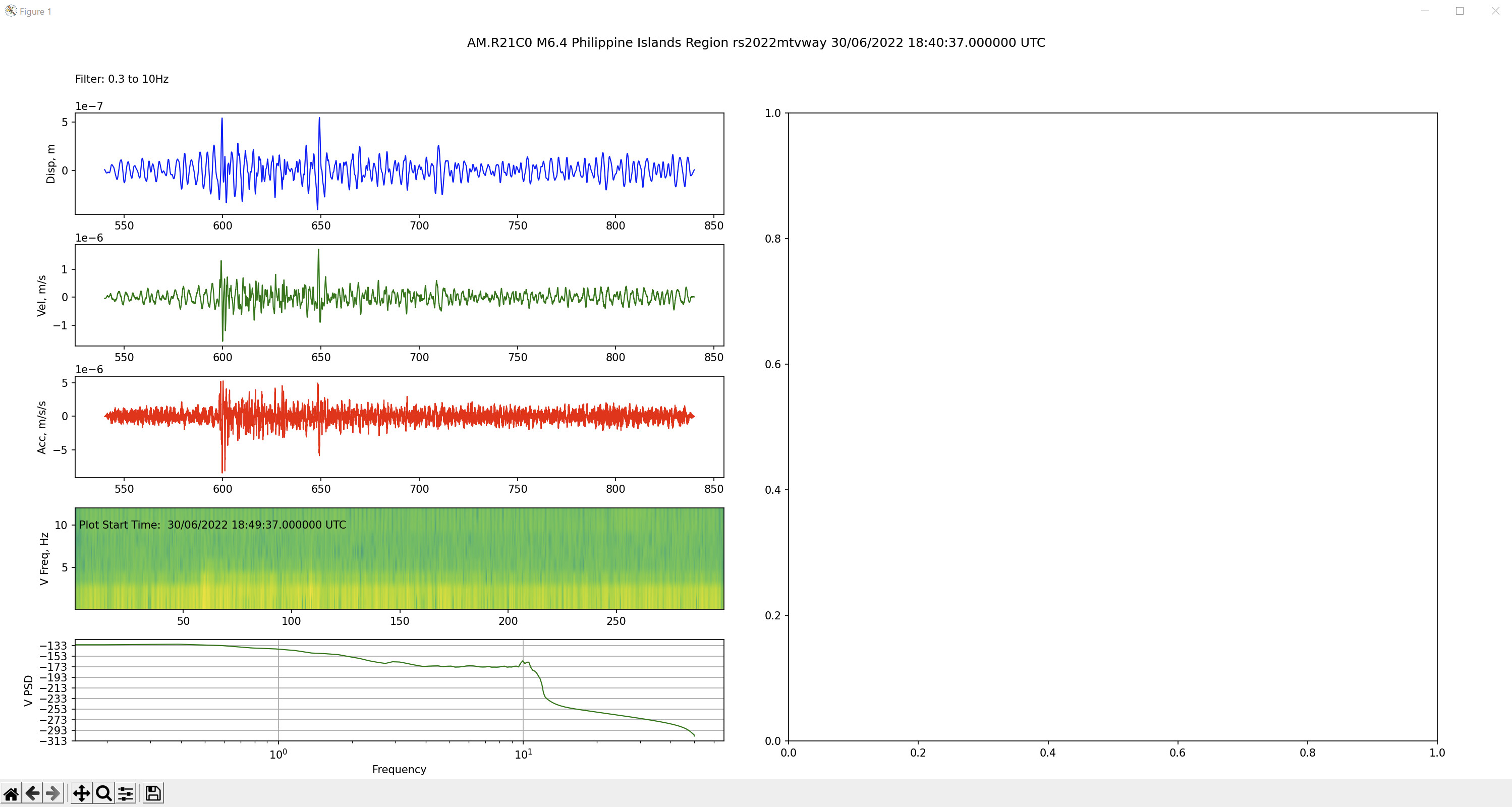
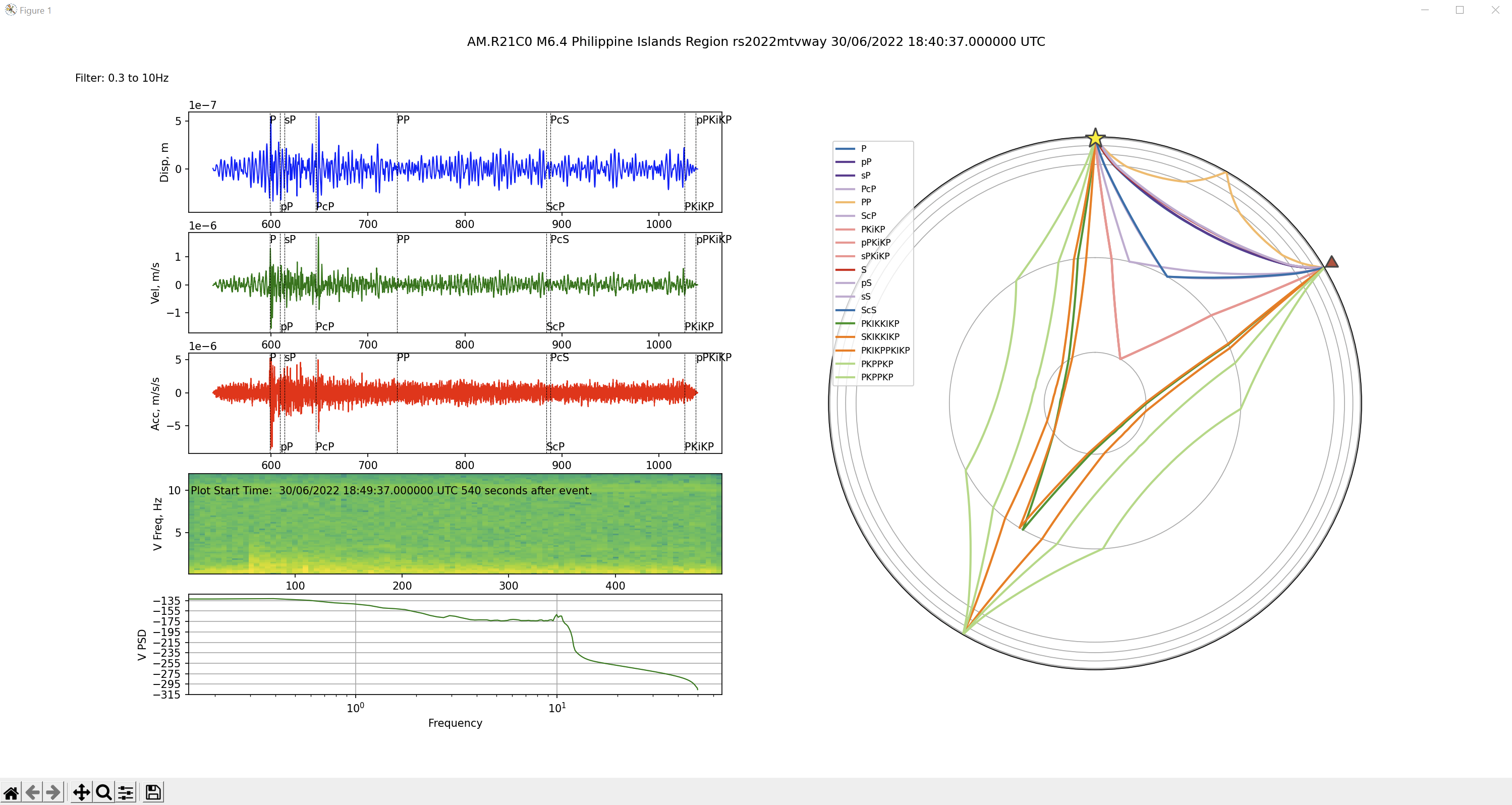
I’ve got the basic parts of the graphs done for D, V and A and the spectrogram and PSD, but I need help with plotting the spherical rays and plotting the arrival times on the D,V and A plots. I don’t have problem producing a stand alone spherical ray plot, but I can’t work out how to get it into a subplot.

Below is the code so far, including commented out code that either I’ve used for development and testing or has simply failed and I don’t know how to fix ATM. I’ll also post the output so far FYI. The RH half of the page is where I was the spherical ray plot.

I would appreciate any tips and pointers in the right direction, or any example code anyone is prepared to share. I apologise in advance that the code may not be the tidiest, or adhering to any conventions as I’m pretty new to Python. ;o)

Al.


from obspy.clients.fdsn import Client
from obspy.core import UTCDateTime, Stream
from obspy.signal import filter
import matplotlib.pyplot as plt
from obspy.taup import TauPyModel
import math
rs = Client('RASPISHAKE')

# set the station name and download the response information
stn = 'R21C0'                            # your station name
inv = rs.get_stations(network='AM', station=stn, level='RESP')
latS = -33.7691     #station latitude
lonS = 149.8843     #station longitude
eleS = 1114         #station elevation

#enter event data
eventTime = UTCDateTime(2022, 6, 30, 18, 40, 37) # (YYYY, m, d, H, M, S)

latE = 19.0                            # quake latitude
lonE = 121.3                           # quake longitude
depth = 35                             # quake depth, km
mag = 6.4                              # quake magnitude
eventID = 'rs2022mtvway'               # ID for the event
locE = 'Philippine Islands Region'     # location name

#set start time
delay = 540                     # delay the start of the plot from the event
start = eventTime + delay       # calculate the plot start time from the event and delay
end = start + 300               # calculate the end time from the start and duration

# set the FDSN server location and channel names
ch = 'EHZ' # ENx = accelerometer channels; EHx or SHZ = geophone channels

# get waveform and copy it for independent removal of instrument response
trace0 = rs.get_waveforms('AM', stn, '00', ch, start, end)
trace1 = trace0.copy()
trace2 = trace0.copy()

# calculate great circle angle of separation
# convert angles to radians
latSrad = math.radians(latS)
lonSrad = math.radians(lonS)
latErad = math.radians(latE)
lonErad = math.radians(lonE)

if lonSrad > lonErad:
    lon_diff = lonSrad - lonErad
else:
    lon_diff = lonErad - lonSrad

great_angle_rad = math.acos(math.sin(latErad)*math.sin(latSrad)+math.cos(latErad)*math.cos(latSrad)*math.cos(lon_diff))
great_angle_deg = math.degrees(great_angle_rad)

model = TauPyModel(model='iasp91')
arrs = model.get_travel_times(depth, great_angle_deg)
print(arrs)
#arrs.plot_times(plot_all=True)
arrivals = model.get_ray_paths(depth, great_angle_deg, phase_list=['ttbasic'])
#arrivals.plot_rays(plot_type='spherical', phase_list=['ttbasic'], legend=True)

# bandpass filter
filt = [0.1, 0.3, 10, 12]      

# Create output traces
outdisp = trace0.remove_response(inventory=inv,pre_filt=filt,output='DISP',water_level=60, plot=False) # convert to Disp
outvel = trace1.remove_response(inventory=inv,pre_filt=filt,output='VEL',water_level=60, plot=False) # convert to Vel
outacc = trace2.remove_response(inventory=inv,pre_filt=filt,output='ACC',water_level=60, plot=False) # convert to Acc

# set up plot
fig = plt.figure(figsize=(20,10))       # set to page size in inches
ax1 = fig.add_subplot(5,2,1)            # displacement waveform
ax2 = fig.add_subplot(5,2,3)            # velocity Waveform
ax3 = fig.add_subplot(5,2,5)            # acceleration waveform
ax4 = fig.add_subplot(5,2,7)            # velocity spectrogram
ax5 = fig.add_subplot(5,2,9)            # velocity PSD
ax7 = fig.add_subplot(5,2,(2,10))       # TAUp plot
fig.suptitle("AM."+stn+" M"+str(mag)+" "+locE+" "+eventID+eventTime.strftime(' %d/%m/%Y %H:%M:%S.%f UTC'))  #Title of the figure
fig.text(0.05, 0.92, "Filter: "+str(filt[1])+" to "+str(filt[2])+"Hz")

#plot traces
ax1.plot(trace0[0].times(reftime=eventTime), outdisp[0].data, lw=1, color='b')      # displacement waveform
#ax1.plot(arrs.times())
ax2.plot(trace0[0].times(reftime=eventTime), outvel[0].data, lw=1, color='g')       # velocity Waveform
ax3.plot(trace0[0].times(reftime=eventTime), outacc[0].data, lw=1, color='r')       # acceleration waveform
ax4.specgram(x=trace1[0], NFFT=64, noverlap=16, Fs=100, cmap='viridis')         # velocity spectrogram
ax4.set_ylim(filt[0],filt[3])
ax5.psd(x=trace1[0], NFFT=512, noverlap=2, Fs=100, color='g', lw=1)             # velocity PSD
ax5.set_xscale('log')
#ax7.arrivals.plot_rays(plot_type='spherical', phase_list=['ttbasic'], legend=True)

# set up some plot details
ax1.set_ylabel("Disp, m")
ax2.set_ylabel("Vel, m/s")
ax3.set_ylabel("Acc, m/s/s")         
ax4.set_ylabel("V Freq, Hz")
ax5.set_ylabel("V PSD")

# get the limits of the y axis so text can be consistently placed
ax4b, ax4t = ax4.get_ylim()
ax4.text(2, ax4t*0.8, 'Plot Start Time: '+start.strftime(' %d/%m/%Y %H:%M:%S.%f UTC'))

#adjust subplots for readability
plt.subplots_adjust(hspace=0.3, wspace=0.1, left=0.05, right=0.95, bottom=0.05)

# save the final figure
#plt.savefig(str(mag)+'Quake'+eventID+eventTime.strftime('%Y%m%d %H%M%S UTC'))  #comment this line out till figure is final

# show the final figure
plt.show()

1 Like

I’ve eventually cracked it. Thanks to rainy weather…
Here’s the working result FYI, though I intend to tidy it up and add a few more features to it as time goes by.


from obspy.clients.fdsn import Client
from obspy.core import UTCDateTime, Stream
from obspy.signal import filter
import matplotlib.pyplot as plt
from obspy.taup import TauPyModel
import math
rs = Client('RASPISHAKE')

def plot_arrivals(ax):
    y1 = -1
    for q in range(0, no_varrs):            #plot each arrival in turn
        x1 = vis_arrs[q].time               # extract the time to plot
        ax.axvline(x=x1, linewidth=0.5, linestyle='--', color='black')      # draw a vertical line
        axb, axt = ax.get_ylim()                                            # calculate the y limits of the graph
        if y1 < 0:                      # alternate top and bottom for phase tags
            y1 = axt*0.8
        else:
            y1 = axb*0.95
        ax.text(x1,y1,vis_arrs[q].name)                                 # print the phase name
        
# set the station name and download the response information
stn = 'R21C0'                            # your station name
inv = rs.get_stations(network='AM', station=stn, level='RESP')
latS = -33.7691     #station latitude
lonS = 149.8843     #station longitude
eleS = 1114         #station elevation

#enter event data
eventTime = UTCDateTime(2022, 6, 30, 18, 40, 37) # (YYYY, m, d, H, M, S)

latE = 19.0                            # quake latitude
lonE = 121.3                           # quake longitude
depth = 35                             # quake depth, km
mag = 6.4                              # quake magnitude
eventID = 'rs2022mtvway'               # ID for the event
locE = 'Philippine Islands Region'     # location name

#set start time
delay = 540                     # delay the start of the plot from the event
duration = 500                  # duration of plots
start = eventTime + delay       # calculate the plot start time from the event and delay
end = start + duration               # calculate the end time from the start and duration

# set the FDSN server location and channel names
ch = 'EHZ' # ENx = accelerometer channels; EHx or SHZ = geophone channels

# get waveform and copy it for independent removal of instrument response
trace0 = rs.get_waveforms('AM', stn, '00', ch, start, end)
trace1 = trace0.copy()
trace2 = trace0.copy()

# calculate great circle angle of separation
# convert angles to radians
latSrad = math.radians(latS)
lonSrad = math.radians(lonS)
latErad = math.radians(latE)
lonErad = math.radians(lonE)

if lonSrad > lonErad:
    lon_diff = lonSrad - lonErad
else:
    lon_diff = lonErad - lonSrad

great_angle_rad = math.acos(math.sin(latErad)*math.sin(latSrad)+math.cos(latErad)*math.cos(latSrad)*math.cos(lon_diff))
great_angle_deg = math.degrees(great_angle_rad)

model = TauPyModel(model='iasp91')
arrs = model.get_travel_times(depth, great_angle_deg)
print(arrs)
no_arrs = len(arrs)     # the number of arrivals

#find the phase arrivals that are visible in the plots
vis_arrs = arrs                 # Copy arrivals
vis_arrs.reverse()              # reverse the list
while True:                                 # get rid of those passt the plot
    if vis_arrs[0].time > delay+duration:
        del(vis_arrs[0:1])
    else:
        break
vis_arrs.reverse()              # reverse the list back again
while True:                                 # get rid of those before the plot
    if vis_arrs[0].time < delay:
        del(vis_arrs[0:1])
    else:
        break
print(vis_arrs)
no_varrs = len(vis_arrs)        # number of visible arrivals

#arrs.plot_times(plot_all=True)
arrivals = model.get_ray_paths(depth, great_angle_deg, phase_list=['ttbasic'])
#arrivals.plot_rays(plot_type='spherical', phase_list=['ttbasic'], legend=True)

# bandpass filter
filt = [0.1, 0.3, 10, 12]      

# Create output traces
outdisp = trace0.remove_response(inventory=inv,pre_filt=filt,output='DISP',water_level=60, plot=False) # convert to Disp
outvel = trace1.remove_response(inventory=inv,pre_filt=filt,output='VEL',water_level=60, plot=False) # convert to Vel
outacc = trace2.remove_response(inventory=inv,pre_filt=filt,output='ACC',water_level=60, plot=False) # convert to Acc

# set up plot
fig = plt.figure(figsize=(20,10))       # set to page size in inches
ax1 = fig.add_subplot(5,2,1)            # displacement waveform
ax2 = fig.add_subplot(5,2,3)            # velocity Waveform
ax3 = fig.add_subplot(5,2,5)            # acceleration waveform
ax4 = fig.add_subplot(5,2,7)            # velocity spectrogram
ax5 = fig.add_subplot(5,2,9)            # velocity PSD
ax7 = fig.add_subplot(5,2,(2,10), polar=True)       # TAUp plot
fig.suptitle("AM."+stn+" M"+str(mag)+" "+locE+" "+eventID+eventTime.strftime(' %d/%m/%Y %H:%M:%S.%f UTC'))  #Title of the figure
fig.text(0.05, 0.92, "Filter: "+str(filt[1])+" to "+str(filt[2])+"Hz")

#plot traces
ax1.plot(trace0[0].times(reftime=eventTime), outdisp[0].data, lw=1, color='b')      # displacement waveform
ax2.plot(trace0[0].times(reftime=eventTime), outvel[0].data, lw=1, color='g')       # velocity Waveform
ax3.plot(trace0[0].times(reftime=eventTime), outacc[0].data, lw=1, color='r')       # acceleration waveform
ax4.specgram(x=trace1[0], NFFT=512, noverlap=2, Fs=100, cmap='viridis')         # velocity spectrogram
ax4.set_ylim(filt[0],filt[3])
ax5.psd(x=trace1[0], NFFT=512, noverlap=2, Fs=100, color='g', lw=1)             # velocity PSD
ax5.set_xscale('log')

#plot phase arrivals
plot_arrivals(ax1)          #plot arrivals on displacement plot
plot_arrivals(ax2)          #plot arrivals on velocity plot
plot_arrivals(ax3)          #plot arrivals on acceleration plot

# set up some plot details
ax1.set_ylabel("Disp, m")
ax2.set_ylabel("Vel, m/s")
ax3.set_ylabel("Acc, m/s/s")         
ax4.set_ylabel("V Freq, Hz")
ax5.set_ylabel("V PSD")

# get the limits of the y axis so text can be consistently placed
ax4b, ax4t = ax4.get_ylim()
ax4.text(2, ax4t*0.8, 'Plot Start Time: '+start.strftime(' %d/%m/%Y %H:%M:%S.%f UTC ')+str(delay)+' seconds after event.')      # explain difference in x time scale

#plot the ray paths
ax7 = arrivals.plot_rays(plot_type='spherical', ax=ax7, fig=fig, phase_list=['ttbasic'], legend=True)

#adjust subplots for readability
plt.subplots_adjust(hspace=0.3, wspace=0.1, left=0.05, right=0.95, bottom=0.05)

# save the final figure
#plt.savefig(str(mag)+'Quake'+eventID+eventTime.strftime('%Y%m%d %H%M%S UTC'))  #comment this line out till figure is final

# show the final figure
plt.show()


2 Likes

Good work, thank you. This is useful…
Marco

2 Likes

This looks like a very interesting report output sheeny!

Looking forward to your future implementations!

1 Like

I don’t really know if comparing the displacement, velocity and acceleration has any relevance in seismology, but having had some experience with vibration analysis for condition monitoring of machines I’m used to using the three as appropriate. So I wanted to do this as much out of curiosity as familiarity.

In VA we typically used velocity for most things as the energy of the vibration is proportional to the square of the velocity regardless of frequency, so we know peaks of the same size have the same energy and are doing the same damage and affect the expected time to failure in the same way.

For very fast machines, we’d use acceleration, however, as this would bias the high frequencies, so we could see any faults developing before they were significant enough to appear in the velocity spectrum. This is important because fast machines often have a very short time between fault development and failure.

Likewise for very slow machines, we use displacement to highlight the faults before they appear in the velocity spectrum because usually by the time they appear in the velocity spectrum they are very serious and there’s very little time left before failure to intervene and plan a shut to fix it before more collateral damage.

So far I’m encouraged though. I’ve had one quake so far where the velocity and displacement plots were bordering on marginal, but the acceleration plot was as clear and well formed as could be.

FWIW here’s the latest code and example output. I hope it helps someone with their coding.


from obspy.clients.fdsn import Client
from obspy.core import UTCDateTime, Stream
from obspy.signal import filter
import matplotlib.pyplot as plt
from obspy.taup import TauPyModel
import math
rs = Client('RASPISHAKE')

def plot_arrivals(ax):
    y1 = -1
    axb, axt = ax.get_ylim()               # calculate the y limits of the graph
    for q in range(0, no_arrs):            #plot each arrival in turn
        x1 = arrs[q].time              # extract the time to plot
        if (x1 >= delay):
            if x1 < delay+duration:
                ax.axvline(x=x1, linewidth=0.5, linestyle='--', color='black')      # draw a vertical line
                if y1 < 0:                      # alternate top and bottom for phase tags
                    y1 = axt*0.8
                else:
                    y1 = axb*0.95
                ax.text(x1,y1,arrs[q].name)                                 # print the phase name
        
# set the station name and download the response information
stn = 'R21C0'                            # your station name
inv = rs.get_stations(network='AM', station=stn, level='RESP')  # get the instrument response
latS = -33.7691     #station latitude
lonS = 149.8843     #station longitude
eleS = 1114         #station elevation

#enter event data
eventTime = UTCDateTime(2022, 7, 4, 7, 27, 21) # (YYYY, m, d, H, M, S)
latE = -15.7                            # quake latitude
lonE = 177.6                           # quake longitude
depth = 425                             # quake depth, km
mag = 5.2                              # quake magnitude
eventID = 'rs2022naillu'               # ID for the event
locE = 'Fiji Islands Region'     # location name

#set start time
delay = 0                     # delay the start of the plot from the event
duration = 1200                  # duration of plots
start = eventTime + delay       # calculate the plot start time from the event and delay
end = start + duration               # calculate the end time from the start and duration

# set the FDSN server location and channel names
ch = 'EHZ' # ENx = accelerometer channels; EHx or SHZ = geophone channels

# get waveform and copy it for independent removal of instrument response
trace0 = rs.get_waveforms('AM', stn, '00', ch, start, end)
trace1 = trace0.copy()
trace2 = trace0.copy()

# calculate great circle angle of separation
# convert angles to radians
latSrad = math.radians(latS)
lonSrad = math.radians(lonS)
latErad = math.radians(latE)
lonErad = math.radians(lonE)

if lonSrad > lonErad:
    lon_diff = lonSrad - lonErad
else:
    lon_diff = lonErad - lonSrad

great_angle_rad = math.acos(math.sin(latErad)*math.sin(latSrad)+math.cos(latErad)*math.cos(latSrad)*math.cos(lon_diff))
great_angle_deg = math.degrees(great_angle_rad)     #great circle angle between quake and station
distance = great_angle_rad*12742/2      #calculate distance between quake and station in km

model = TauPyModel(model='iasp91')
arrs = model.get_travel_times(depth, great_angle_deg)
print(arrs)
no_arrs = len(arrs)     # the number of arrivals

# bandpass filter
filt = [0.1, 0.3, 2, 2.5]      

# Create output traces
outdisp = trace0.remove_response(inventory=inv,pre_filt=filt,output='DISP',water_level=60, plot=False) # convert to Disp
outvel = trace1.remove_response(inventory=inv,pre_filt=filt,output='VEL',water_level=60, plot=False) # convert to Vel
outacc = trace2.remove_response(inventory=inv,pre_filt=filt,output='ACC',water_level=60, plot=False) # convert to Acc

# set up plot
fig = plt.figure(figsize=(20,12))       # set to page size in inches
ax1 = fig.add_subplot(5,2,1)            # displacement waveform
ax2 = fig.add_subplot(5,2,3)            # velocity Waveform
ax3 = fig.add_subplot(5,2,5)            # acceleration waveform
ax4 = fig.add_subplot(5,2,7)            # velocity spectrogram
ax5 = fig.add_subplot(5,2,9)            # velocity PSD
ax7 = fig.add_subplot(5,2,(2,8), polar=True)       # TAUp plot
fig.suptitle("AM."+stn+" M"+str(mag)+" "+locE+" "+eventID+eventTime.strftime(' %d/%m/%Y %H:%M:%S.%f UTC'))      #Title of the figure
fig.text(0.05, 0.92, "Filter: "+str(filt[1])+" to "+str(filt[2])+"Hz")          # Filter details
fig.text(0.2, 0.92, 'Separation = '+str(round(great_angle_deg,3))+u"\N{DEGREE SIGN}"+' or '+str(int(distance))+'km.')   #distance between quake and station
fig.text(0.4, 0.92, 'Latitude: '+str(latE)+u"\N{DEGREE SIGN}"+' Longitude: '+str(lonE)+u"\N{DEGREE SIGN}"+' Depth: '+str(depth)+'km.')  #quake lat, lon and depth

#plot traces
ax1.plot(trace0[0].times(reftime=eventTime), outdisp[0].data, lw=1, color='b')      # displacement waveform
ax2.plot(trace0[0].times(reftime=eventTime), outvel[0].data, lw=1, color='g')       # velocity Waveform
ax3.plot(trace0[0].times(reftime=eventTime), outacc[0].data, lw=1, color='r')       # acceleration waveform
ax4.specgram(x=trace1[0], NFFT=512, noverlap=2, Fs=100, cmap='viridis')         # velocity spectrogram
ax4.set_ylim(filt[0],filt[3])
ax5.psd(x=trace1[0], NFFT=512, noverlap=2, Fs=100, color='g', lw=1)             # velocity PSD
ax5.set_xscale('log')

# build array of arrival data
x2 = 0.5
dx = 0.008
fig.text(x2, 0.05, 'Phase  Time  Incident<',rotation=90)
for i in range (0, no_arrs):
    x2 += dx
    fig.text(x2, 0.05, arrs[i].name+'   '+str(round(arrs[i].time,3))+'s   '+str(round(arrs[i].incident_angle,1))+u"\N{DEGREE SIGN}", rotation=90)

#plot phase arrivals
plot_arrivals(ax1)          #plot arrivals on displacement plot
plot_arrivals(ax2)          #plot arrivals on velocity plot
plot_arrivals(ax3)          #plot arrivals on acceleration plot

# set up some plot details
ax1.set_ylabel("Disp, m")
ax2.set_ylabel("Vel, m/s")
ax3.set_ylabel("Acc, m/s/s")         
ax4.set_ylabel("V Freq, Hz")
ax5.set_ylabel("V PSD, dB")
#fig.text(0.8, 0.05, arrs)   # List the arrivals


# get the limits of the y axis so text can be consistently placed
ax4b, ax4t = ax4.get_ylim()
ax4.text(2, ax4t*0.8, 'Plot Start Time: '+start.strftime(' %d/%m/%Y %H:%M:%S.%f UTC ')+str(delay)+' seconds after event.')      # explain difference in x time scale

#adjust subplots for readability
plt.subplots_adjust(hspace=0.3, wspace=0.1, left=0.05, right=0.95, bottom=0.05)

#plot the ray paths
arrivals = model.get_ray_paths(depth, great_angle_deg, phase_list=['ttbasic'])      #calculate the ray paths
ax7 = arrivals.plot_rays(plot_type='spherical', ax=ax7, fig=fig, phase_list=['ttbasic'], show=False, legend=True)   #plot the ray paths

# Annotate regions
ax7.text(0, 0, 'Solid\ninner\ncore',
        horizontalalignment='center', verticalalignment='center',
        bbox=dict(facecolor='white', edgecolor='none', alpha=0.7))
ocr = (model.model.radius_of_planet -
       (model.model.s_mod.v_mod.iocb_depth +
        model.model.s_mod.v_mod.cmb_depth) / 2)
ax7.text(math.radians(180), ocr, 'Fluid outer core',
        horizontalalignment='center',
        bbox=dict(facecolor='white', edgecolor='none', alpha=0.7))
mr = model.model.radius_of_planet - model.model.s_mod.v_mod.cmb_depth / 2
ax7.text(math.radians(180), mr, 'Solid mantle',
        horizontalalignment='center',
        bbox=dict(facecolor='white', edgecolor='none', alpha=0.7))

# save the final figure
plt.savefig('E:\Pictures\Raspberry Shake and Boom\M'+str(mag)+'Quake '+locE+eventID+eventTime.strftime('%Y%m%d %H%M%S UTC.png'))  #comment this line out till figure is final

# show the final figure
plt.show()

I’ve added the incident angle to the output as well. The RS&B only measures the vertical motion so it’s handy to know the incident angle as that affects the signal strength. I expected to see flatter incident angles for close quakes which would reduce the P wave signal and give good S wave signal, but fortunately there seems to be a reasonable vertical component even with close quakes.

1 Like

Hi Shenny, could you please send me a note to my email: s52sk@yahoo.com
Have a question for you, thanks…

Marco

1 Like

Done.

Do you need to check junk mail folder?

Al.

Hi, I am send you email back, yes it was in junk folder…

Marco