I am working on developing my LocalStns.py code to include a series of circles concentric around each station with a radius calculated from the difference in arrival times of the P and S phases. I am having trouble with either calculating the circle or plotting the circle.
Here is the error message I get:
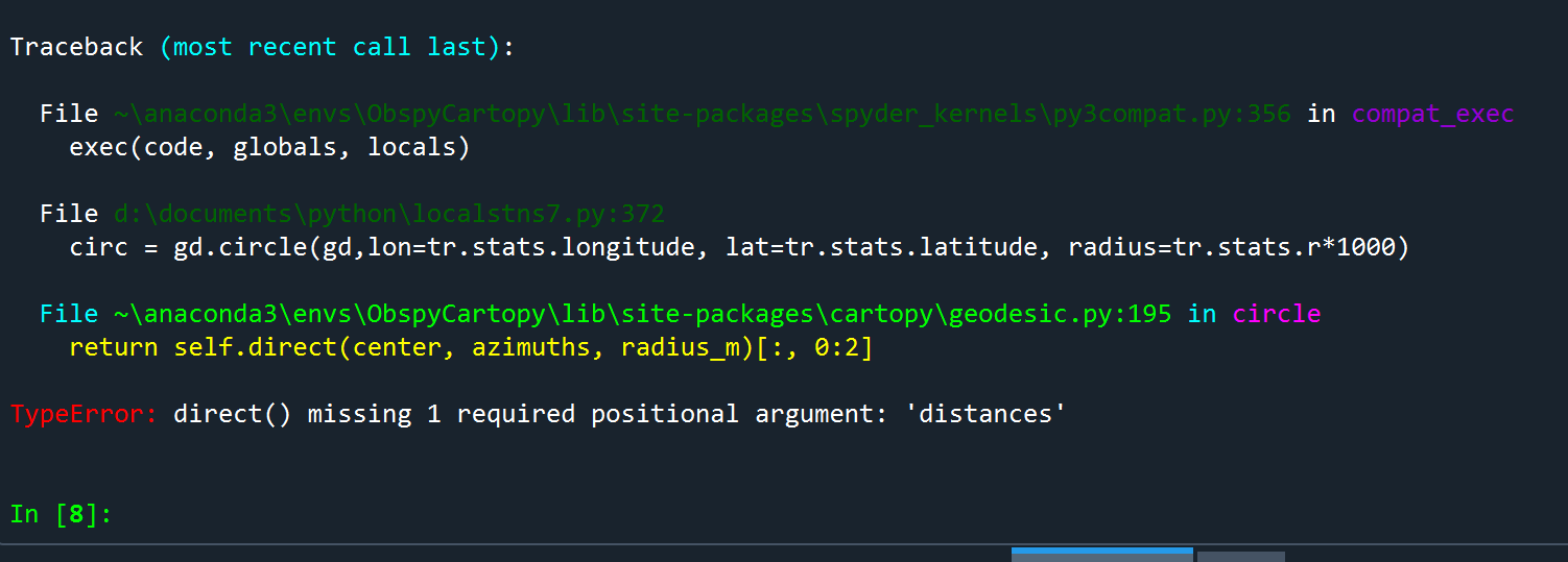
I can’t see where the positional argument ‘distances’ is missing from.
Here is the full code:
# -*- coding: utf-8 -*-
"""
Created on Sun May 21 12:22:53 2023
@author: al72
"""
from obspy.clients.fdsn import Client
from obspy.core import UTCDateTime, Stream
import matplotlib.pyplot as plt
from obspy.taup import TauPyModel
import cartopy.crs as ccrs
import cartopy.feature as cfeature
import numpy as np
import math
from matplotlib.transforms import blended_transform_factory
from matplotlib.cm import get_cmap
from obspy.geodetics import gps2dist_azimuth, kilometers2degrees, degrees2kilometers
import matplotlib.ticker as ticker
from cartopy.geodesic import Geodesic
import shapely.geometry as sgeom
gd = Geodesic
rs = Client('https://data.raspberryshake.org/')
# Build a station list of local stations so unwanted stations can be commented out
# as required to save typing
def stationList(sl):
sl += ['R21C0'] #Oberon
sl += ['R1564'] #Lithgow
sl += ['R811A'] #Mudgee
sl += ['R9AF3'] #Gulgong
sl += ['R571C'] #Coonabarabran
sl += ['R6D2A'] #Coonabarabran
sl += ['RF35D'] #Narrabri
sl += ['R7AF5'] #Muswellbrook
#sl += ['R26B1'] #Murrumbateman
#sl += ['R3756'] #Chatswood
#sl += ['R9475'] #Sydney
#sl += ['R6707'] #Gungahlin
#sl += ['R69A2'] #Penrith
#sl += ['RB18D'] #Canberra
#sl += ['R9A9D'] #Brisbane
#sl += ['RCF6A'] #Brisbane
#sl += ['S6197'] #Heyfield
#sl += ['RD371'] #Melbourne
#sl += ['RC98F'] #Creswick
#sl += ['RA20F'] #Broken Hill
#sl += ['RC74C'] #Broken Hill
#sl += ['RECF1'] #Koroit
#sl += ['R4E78'] #Stawell
#sl += ['RDD97'] #Melbourne
#sl += ['R9CDF'] #Dandenong
#sl += ['RBA56'] #Launceston
#sl += ['RAA90'] #Scamander
#sl += ['RA13F'] #Hobart
#sl += ['R7A67'] #Hobart
#sl += ['R0FFA'] #Hobart
#sl += ['R54E6'] #Blanchetown
#print(sl)
return sl
# Build a list of ranges S-P times from S-P plots
pstimes = [20,
15,
18,
18,
28,
29,
25,
11,
]
# Trace plotting routine for determining S - P time
def trplot (tr, j):
fig1 = plt.figure(figsize=(10,7), dpi=100) # set to page size in inches
axtr = fig1.add_subplot(1,1,1)
st1 = []
st1 += tr
axtr.plot(st1[0].times(reftime=eventTime), st1[0].data, lw=1, color='k') # displacement waveform
axtr.xaxis.set_major_locator(ticker.MultipleLocator(10))
axtr.xaxis.set_minor_locator(ticker.AutoMinorLocator(10))
axtr.grid(color='dimgray', ls = '-.', lw = 0.33)
axtr.grid(color='dimgray', which='minor', ls = ':', lw = 0.33)
fig1.suptitle(str(j), weight='black', color='b', size='large') #Title of the figure
plt.show()
# Build a stream of traces from each of the selected stations
def buildStream(strm, op, rp):
n = len(slist) # n is the number of traces (stations) in the stream
tr1 = []
for i in range(0, n):
inv = rs.get_stations(network='AM', station=slist[i], level='RESP') # get the instrument response
#read each epoch to find the one that's active for the event
k=0
while True:
sta = inv[0][k] #station metadata
if sta.is_active(time=eventTime):
break
k += 1
latS = sta.latitude #active station latitude
lonS = sta.longitude #active station longitude
#eleS = sta.elevation #active station elevation is not required for this program
print(sta) # print the station on the console so you know which, if any, station fails to have data
#find max and min lat and longs for map extents
trace = rs.get_waveforms('AM', station=slist[i], location = "00", channel = '*HZ', starttime = start, endtime = end) #vertical geophone could be EHZ or SHZ
trace.merge(method=0, fill_value='latest') #fill in any gaps in the data to prevent a crash
trace.detrend(type='demean') #detrend the data
tr1 = trace.remove_response(inventory=inv,zero_mean=True,pre_filt=ft,output=op,water_level=60, plot=False) # convert to displacement so ML can be estimated
# save data in the trace.stats for use later
tr1[0].stats.distance = gps2dist_azimuth(latS, lonS, latE, lonE)[0] # distance from the event to the station in metres
tr1[0].stats.latitude = latS # save the station latitude from the inventory with the trace
tr1[0].stats.longitude = lonS # save the station longitude from the inventory with the trace
tr1[0].stats.colour = colours[i % len(colours)] # assign a colour to the station/trace
tr1[0].stats.amp = np.abs(tr1[0].max()/1e-6) # max amplitude in µm, µm/s or µm/s²
if op == 'VEL':
tr1[0].stats.mL = np.log10(tr1[0].stats.amp) + 2.6235*np.log10(tr1[0].stats.distance/1000) - 3.415 #ML by modified Tsuboi Empirical Formula
elif op == 'ACC':
tr1[0].stats.mL = np.log10(tr1[0].stats.amp) + 3.146*np.log10(tr1[0].stats.distance/1000) - 6.154
else:
tr1[0].stats.mL = np.log10(tr1[0].stats.amp) + 2.234*np.log10(tr1[0].stats.distance/1000) - 1.199
strm += tr1
if rp:
trplot(tr1, i)
#strm.plot(method='full', equal_scale=False)
return strm #, nlat, xlat, nlon, xlon
# function to convert kilometres to degrees
def k2d(x):
return kilometers2degrees(x)
# function to convert degrees to kilometres
def d2k(x):
return degrees2kilometers(x)
# function to estimate distance in km from S - P arrival times
def distSP(t):
range = 8e-7*math.pow(t,4)-3e-4*math.pow(t,3)+0.449*math.pow(t,2)+7.726*t
return range
# Build a list of local places for the map
# Lat Long Data from https://www.latlong.net/
# format ['Name', latitude, longitude, markersize]
#comment out those not used to minimise typing
places = [['Oberon', -33.704922, 149.862900, 2],
['Bathurst', -33.419281, 149.577499, 4],
['Lithgow', -33.480930, 150.157410, 4],
['Mudgee', -32.590439, 149.588684, 4],
['Orange', -33.283333, 149.100006, 4],
['Molong', -33.092239, 148.870804, 2],
['Sydney', -33.868820, 151.209290, 6],
['Newcastle', -32.926670, 151.780014, 5],
['Wollongong', -34.427811, 150.893066, 5],
['Coonabarabran', -31.273911, 149.277420, 4],
['Gulgong', -32.362492, 149.532104, 2],
['Narrabri', -30.325060, 149.782974, 4],
['Moree', -29.463551, 149.841721, 4],
['Muswellbrook', -32.265221, 150.888184, 4],
['Singleton', -32.561111, 151.174591, 4],
['Tamworth', -31.092749, 150.932037, 4],
['Gunnedah', -30.976900, 150.251816, 2],
['Boggabri', -30.704121, 150.044098, 2],
['Boorowa', -34.437340, 148.717972, 2],
['Cowra', -33.828144, 148.677856, 4],
['Dubbo', -32.246380, 148.591263, 4],
['Wellington', -32.555988, 148.944824, 4],
['Goulburn', -34.754539, 149.717819, 4],
['Cooma', -36.235291, 149.125275, 4],
['Grafton', -29.690960, 152.932968, 4],
['Coffs Harbour', -30.296350, 153.115692, 4],
['Armidale', -30.512960, 151.669418, 4],
['Brisbane', -27.469770, 153.025131, 6],
['Canberra', -35.280937, 149.130005, 6],
['Albury', -36.073730, 146.913544, 4],
['Wagga Wagga', -35.114750, 147.369614, 4],
['Broken Hill', -31.955891, 141.465347, 4],
['Wilcannia', -31.558981, 143.378464, 4],
['Cobar', -31.494930, 145.840164, 4],
['Brewarrina', -29.960070, 146.855652, 2],
['Melbourne', -37.813629, 144.963058, 6],
['Bairnesdale', -37.825270, 147.628790, 4],
['Ballarat', -37.562160, 143.850250, 4],
['Hobart', -42.882137, 147.327194, 6],
['Launceston', -41.433224, 147.144089, 4]
]
# Enter event data (estimate by trial and error for unregistered events)
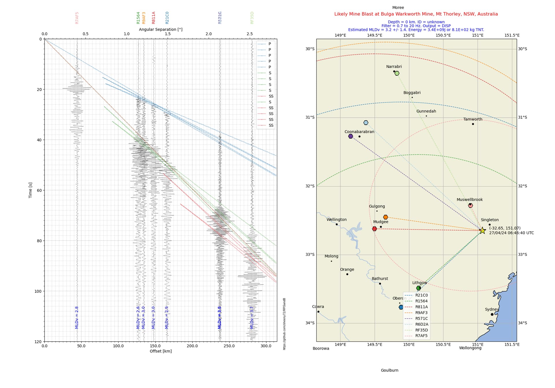
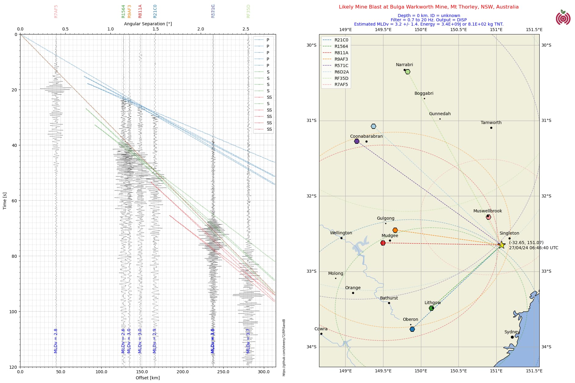
eventTime = UTCDateTime(2024, 4, 27, 6, 46, 40) # (YYYY, m, d, H, M, S) **** Enter data****
latE = -32.65 # quake latitude + N -S **** Enter data****
lonE = 151.07 # quake longitude + E - W **** Enter data****
depth = 0 # quake depth, km **** Enter data****
mag = 3.2 # quake magnitude **** Enter data****
eventID = 'unknown' # ID for the event **** Enter data****
locE = "Bulga Warkworth Mine, Mt Thorley, NSW, Australia" # location name **** Enter data****
# perform range estimate plots
rplots = False
plotrs = True
# Make a list of stations
slist = []
stationList(slist)
# bandpass filter - select to suit system noise and range of quake
#ft = [0.09, 0.1, 0.8, 0.9]
#ft = [0.29, 0.3, 0.8, 0.9]
#ft = [0.49, 0.5, 2, 2.1]
#ft = [0.6, 0.7, 2, 2.1] #distant quake
#ft = [0.6, 0.7, 3, 3.1]
#ft = [0.6, 0.7, 4, 4.1]
#ft = [0.6, 0.7, 6, 6.1]
#ft = [0.6, 0.7, 8, 8.1]
#ft = [0.9, 1, 10, 10.1]
#ft = [0.69, 0.7, 10, 10.1]
ft = [0.69, 0.7, 20, 20.1]
#ft = [2.9, 3, 20, 20.1] #use for local quakes
if plotrs and (len(slist)!=len(pstimes)):
print('Station and PS Times mismatch error!')
# Pretty paired colors. Reorder to have saturated colors first and remove
# some colors at the end. This cmap is compatible with obspy taup - credit to Mark Vanstone for this code.
cmap = get_cmap('Paired', lut=12)
colours = ['#%02x%02x%02x' % tuple(int(col * 255) for col in cmap(i)[:3]) for i in range(12)]
colours = colours[1:][::2][:-1] + colours[::2][:-1]
print(colours)
#colours = ['r', 'b', 'g', 'k', 'c', 'm', 'purple', 'orange', 'gold', 'midnightblue'] # array of colours for stations and phases
plist = ('P', 'S', 'SS') # phase list for plotting
#set up the plot
delay = 0 # for future development for longer distance quakes - leave as 0 for now!
duration = 120 #adjust duration to get detail required
start = eventTime + delay # for future development for longer distance quakes
end = start + duration # for future development for longer distance quakes
output = 'DISP'
#output = 'VEL'
#output = 'ACC'
if output == 'VEL':
mlabel = "MLVv"
mLerr = 1.56
elif output =='ACC':
mlabel = 'MLAv'
mLerr = 1.89
else:
mlabel = 'MLDv'
mLerr = 1.40
# Build the stream of traces/stations
st = Stream()
buildStream(st, output, rplots)
#initialise map extents
minlat = latE
maxlat = latE
minlon = lonE
maxlon = lonE
n = len(st)
for i in range (0, n): # build up map extents from station lat longs
if st[i].stats.latitude < minlat:
minlat = st[i].stats.latitude
if st[i].stats.latitude > maxlat:
maxlat = st[i].stats.latitude
if st[i].stats.longitude < minlon:
minlon = st[i].stats.longitude
if st[i].stats.longitude > maxlon:
maxlon = st[i].stats.longitude
if plotrs:
#add range to trace stats
st[i].stats.r = distSP(pstimes[i])
#print(st[i].stats.r)
#set up the figure
fig = plt.figure(figsize=(20,14), dpi=100) # set to page size in inches
#build the section plot
ax1 = fig.add_subplot(1,2,1)
st.plot(type='section', plot_dx=50e3, recordlength=duration, time_down=True, linewidth=.3, alpha=0.8, grid_linewidth=.25, show=False, fig=fig)
ax1.xaxis.set_minor_locator(ticker.AutoMinorLocator(10))
ax1.yaxis.set_minor_locator(ticker.AutoMinorLocator(10))
# Plot customization: Add station labels to offset axis
ax = ax1.axes
transform = blended_transform_factory(ax.transData, ax.transAxes)
axt, axb = ax1.get_ylim() #get the top and bottom limits of the axes
#print(axt, axb)
j=0
mLav = 0
for t in st:
ax.text(t.stats.distance / 1e3, 1.05, t.stats.station, rotation=90,
va="bottom", ha="center", color=t.stats.colour, transform=transform, zorder=10)
ax.text(t.stats.distance / 1e3, axt-5, mlabel+' = '+str(np.round(t.stats.mL,1)), rotation=90,
va="bottom", ha="center", color = 'b', zorder=10) #print ML estimates
mLav += t.stats.mL
j += 1
#calculate average ML estimate
mLav = mLav/j
#Calculate Earthquake Total Energy
qenergy = 10**(1.5*mLav+4.8)
#setup secondary x axis
secax_x1 = ax1.secondary_xaxis('top', functions = (k2d, d2k)) #secondary axis in degrees separation
secax_x1.set_xlabel('Angular Separation [°]')
secax_x1.xaxis.set_minor_locator(ticker.AutoMinorLocator(10))
#plot arrivals times
model = TauPyModel(model="iasp91")
axl, axr = ax1.get_xlim() # get the left and right limits of the section plot
if axl<0: #if axl is negative, make it zero to start the range for phase plots
axl=0
#axl = 90 # uncomment to adjust left side of section plot, kms
ax1.set_xlim(left = axl)
for j in range (int(axl), int(axr)): # plot phase arrivals every kilometre
arr = model.get_travel_times(depth, k2d(j), phase_list=plist)
n = len(arr)
for i in range(0,n):
if j == int(axr)-1:
ax.plot(j, arr[i].time, marker='o', markersize=1, color = colours[plist.index(arr[i].name) % len(colours)], alpha=0.3, label = arr[i].name)
else:
ax.plot(j, arr[i].time, marker='o', markersize=1, color = colours[plist.index(arr[i].name) % len(colours)], alpha=0.3)
# if j/50 == int(j/50): # periodically plot the phase name
# ax.text(j, arr[i].time, arr[i].name, color=colours[plist.index(arr[i].name) % len(colours)], alpha=0.5, ha='center', va='center')
j+=1
ax.grid(color='dimgray', ls = '-.', lw = 0.33)
ax.grid(color='dimgray', which='minor', ls = ':', lw = 0.33)
ax.legend(loc = 'best')
#plot the map
ax2 = fig.add_subplot(1,2,2, projection=ccrs.PlateCarree())
mt = maxlat+0.5 # latitude of top of map
mb = minlat-0.5 # latitude of the bottom of the map
ml = minlon-0.5 # longitude of the left side of the map
mr = maxlon+0.5 # longitude of the right side of the map
ax2.set_extent([ml,mr,mt,mb], crs=ccrs.PlateCarree())
#ax2.coastlines(resolution='110m') # use for large scale maps
#ax2.stock_img() # use for large scale maps
# Create a features
states_provinces = cfeature.NaturalEarthFeature(
category='cultural',
name='admin_1_states_provinces_lines',
scale='50m',
facecolor='none')
ax2.add_feature(cfeature.LAND)
ax2.add_feature(cfeature.OCEAN)
ax2.add_feature(cfeature.COASTLINE)
ax2.add_feature(states_provinces, edgecolor='gray')
ax2.add_feature(cfeature.LAKES, alpha=0.5)
ax2.add_feature(cfeature.RIVERS)
ax2.gridlines(draw_labels=True)
#plot event/earthquake position on map
ax2.plot(lonE, latE,
color='yellow', marker='*', markersize=20, markeredgecolor='black',
transform=ccrs.Geodetic(),
)
# print the lat, long, and event time beside the event marker
ax2.text(lonE+0.1, latE-0.05, "("+str(latE)+", "+str(lonE)+")\n"+eventTime.strftime('%d/%m/%y %H:%M:%S UTC'), ha='left')
#plot station positions on map
for tr in st:
ax2.plot(tr.stats.longitude, tr.stats.latitude,
color=tr.stats.colour, marker='H', markersize=12, markeredgecolor='black',
transform=ccrs.Geodetic(),
)
ax2.plot([tr.stats.longitude, lonE], [tr.stats.latitude, latE],
color=tr.stats.colour, linewidth=1, linestyle='--',
transform=ccrs.Geodetic(), label = tr.stats.station,
)
if plotrs:
circ = gd.circle(gd,lon=tr.stats.longitude, lat=tr.stats.latitude, radius=tr.stats.r*1000)
ax2.plot(sgeom.Polygon(circ),
color=tr.stats.colour, linewidth=1, linestyle='--',
transform=ccrs.Geodetic()
)
ax2.legend()
#plot only the places inside the map boundary
for pl in places:
if pl[2]>ml and pl[2]<mr: #test for longtiude inside the map
if pl[1]mb: #test for latitude inside the map
ax2.plot(pl[2], pl[1], color='k', marker='o', markersize=pl[3], markeredgecolor='k', transform=ccrs.Geodetic(), label=pl[0])
ax2.text(pl[2], pl[1]+0.05, pl[0], horizontalalignment='center', transform=ccrs.Geodetic())
#add Notes
#fig.text(0.75, 0.96, 'M'+str(mag)+' Earthquake at '+locE, ha='center', size = 'large', color='r') # use for identified earthquakes
fig.text(0.75, 0.96, 'Likely Mine Blast at '+locE, ha='center', size = 'large', color='r') # use for unidentified events
fig.text(0.75, 0.94, 'Depth = '+str(depth)+' km. ID = '+eventID, ha='center', color = 'b')
fig.text(0.75, 0.93, 'Filter = '+str(ft[1])+' to '+str(ft[2])+' Hz. Output = '+output, ha='center', color = 'b')
fig.text(0.75, 0.92, 'Estimated '+mlabel+' = '+str(np.round(mLav,1))+' +/- '+str(mLerr)+'. Energy = '+f"{qenergy:0.1E}"+'J or '+f"{qenergy/4.18e6:0.1E}"+' kg TNT.', ha='center', color = 'b')
# add github repository address for code
fig.text(0.51, 0.1,'https://github.com/sheeny72/RPiSandB', size='x-small', rotation=90)
# plot logos
rsl = plt.imread("RS logo.png")
newaxr = fig.add_axes([0.935, 0.915, 0.05, 0.05], anchor='NE', zorder=-1)
newaxr.imshow(rsl)
newaxr.axis('off')
plt.subplots_adjust(wspace=0.1)
# add a plt.savefig(filename) line here if required.
plt.show()
FYI the code is intended to be run twice:
The first time with rplots = True in line 198, and plotrs = False in line 199. This produces a series of high resolution trace plots to determine the S - P arrival times for each station which are then manually entered into the array pstimes (in lines 64 to 72).
Once the pstimes array is complete, the code is run again with rplots = False in line 198 and plotrs = True in line 199. This is the state in which I have presented the code above.
The intent is to plot radius cicles around each station in the same was as EQ Locator does, hopefully to speed up the trial and error process of finding the quake or mine blast location, and to give some graphical indication of the precision of the final location estimate.
The code where the circle is calculated and plotted is in lines 371 to 376.
Thanks,
Al.