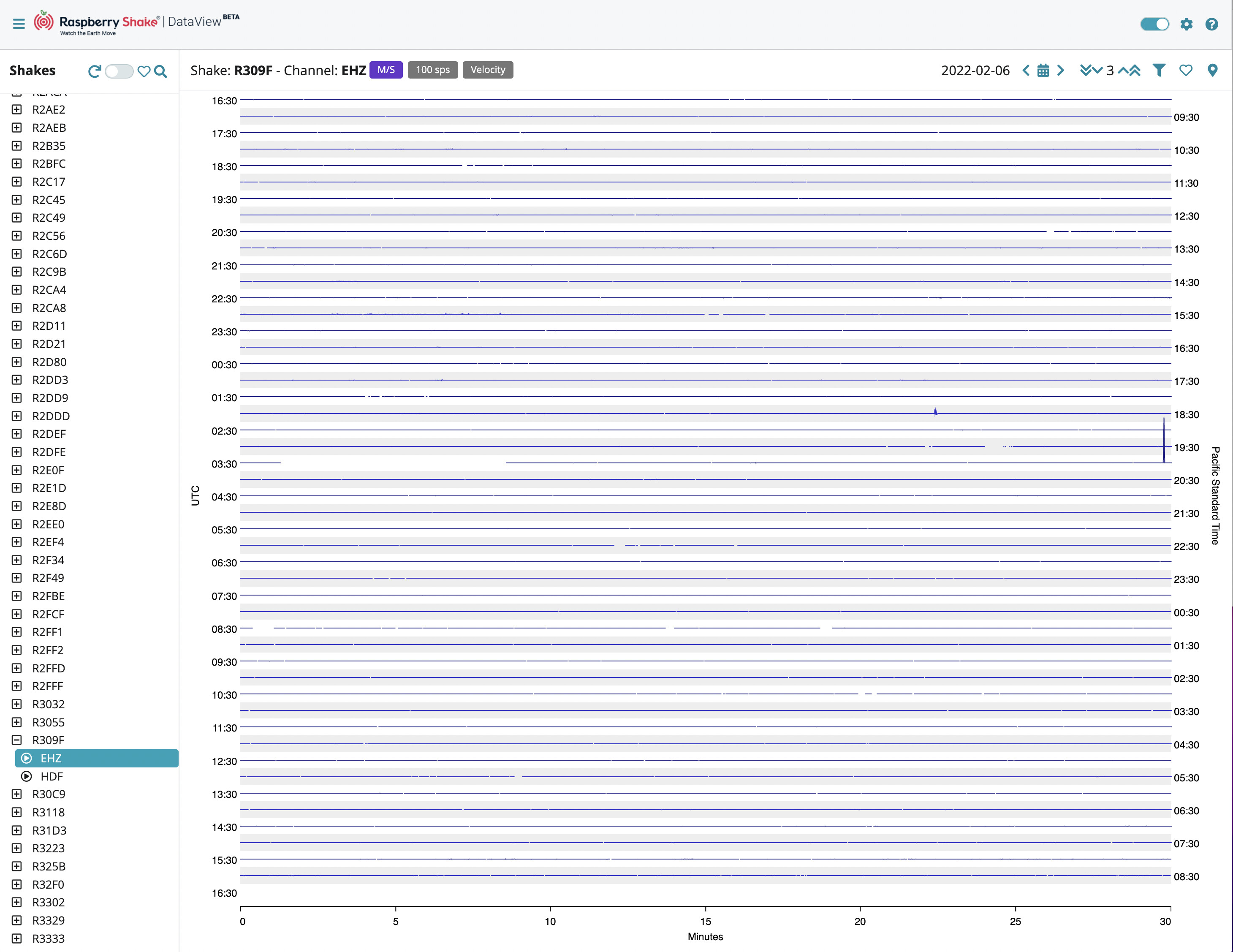
In general, the autoscaling of the helicorder display works well, but occasionally there are problems.
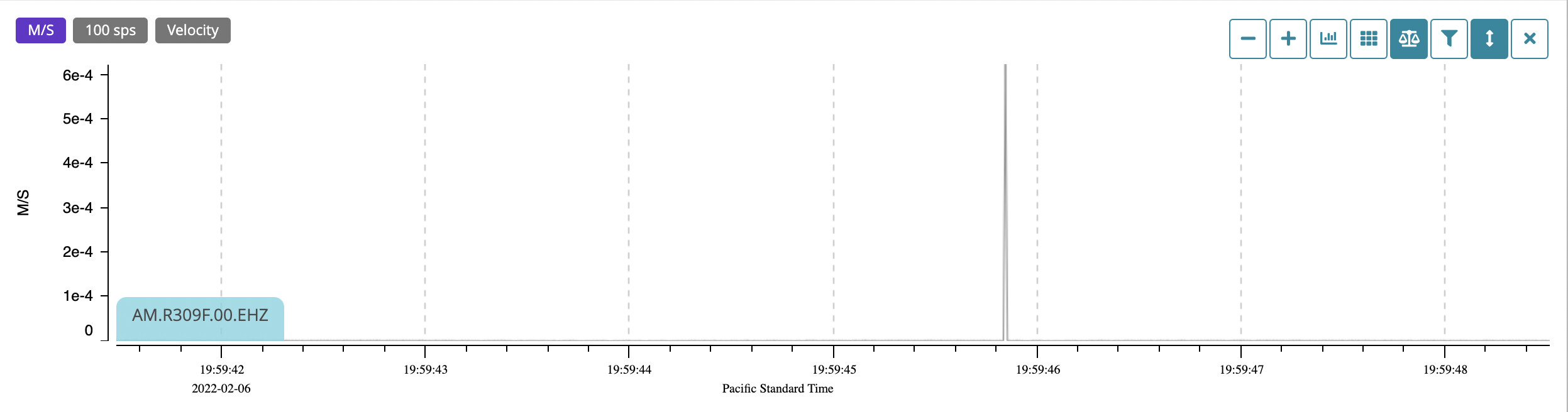
From time to time, and no idea why, I see spikes in the data. Fairly obviously not real ground movement.
In trying to display these limited to a 3 band limit on the display, all the real data gets compressed to the point where it is just not visible.
I would suggest a “compression limit” flag which would probably just clip above a certain level, and indicate clipping by (for example) marking it in red.
We currently have two “screens”, one being a streaming view of a selected station, and the other being a helicorder view of a much longer period of data from that station.
What I think might be useful is a third “screen” displaying simultaneous streams from a number of selected stations. This enables, at a glance, to determine if a given signal is purely local to one station, or a more interesting event detected by several (or all) stations being monitored.
Example: I recently noticed something on the data stream from my station, and wrote it off as local. Then, just out of interest, switched to the stream of the next closest station. It showed the same event, then switched to a third, more remote station, it too showed the event.
There is no way (that I can see…) currently to compare data from multiple stations, having that data displayed concurrently on the screen.
Could not agree more, Philip! Living in an aseismic zone on the North American craton, I have created a semi-circle cohort of other RS’s between my RS3D and potential Alaska / Pacific North West / California seismic events. I found myself going back and forth between each station, trying to see what they see vs. what I see manually, versus “Significant Events” from firstly the Last Quake app and then the ShakeNet events. FYI, I wrote my use case details down in an earlier thread.
I have moved all the messages in a single topic so we can stay focused on the DataView suggestions in one place.
Firstly, thank you very much for what you have proposed, and the time you have spent in thinking about the proposals themselves.
Spikes are unfortunately present, sometimes I also get them when a neigbour just closes their door a bit harder or I step too close to the Shake, and they can create that issue in the overall display. The multiple station monitoring sounds definitely interesting, and I would love having something similar too!
I have passed everything to our software developer team. Let’s see what they can do about this.
I did wonder about using the existing thread, but wasn’t sure if it might get confusing - probably not though.
Since DataView is clearly marked BETA, I wouldn’t be surprised if your dev. team already had ideas in the direction of multiple streaming displays, just wanted to get the basics tested and solid first.
One more suggestion: I for one don’t mind an accurate set of coordinates for my station being displayed, but can understand that some people might. An option on each station configuration to allow full coordinates to be displayed might be useful to some - default would be the current obfuscated coordinates.
But SWARM already does this, as shown on the screen shot below which compares the signal for a nearby EQ (2.5 magnitude at 5 km depth) at an RS1D in town near a major thoroughfare (left) and at a remote location (right). Road noise obscures the signal in town, but the event is clearly displayed at the remote site.
Swarm is unsupported (dead).
I prefer to stick with software that is supported, and actually like the DataView model better.
Especially the live stream view.
Add another suggestion (although, given how it looks that it is implemented, it may not be simple):
When changing the amplification factor it would be good if it only applied to the current device/channel.
Currently, it is a global setting, applied to all channels, and every device viewed.
What is appropriate for one device/channel is likely to be inappropriate for all others.
The list of devices in the left-hand column seems to be sorted alpha-numerically, which is fine when you are looking for a known device. However, it might be useful to be able to sort by location, so that it is easy to find/inspect stations within a given area.
E.g. Sort by longitude and latitude within that (or vice-versa).
I just hope they are generally useful suggestions.
It occurred to me that a real-world use case tying some of these together might be useful.
You can probably begin to see it by looking at this:
The question there is really looking for ideas of what the infrasound “spike” at the end of the event is, but before getting there I wanted to see if this was a purely local event, or if other devices in the same geographical area had seen it too.
To do that required swapping back and forth between StationView (to find device IDs) and DataView to inspect the data from a chosen device, and to screen grab the trace from each station as I visited it so that I could compare them. It would have been so much easier if I could display several traces, then easily locate nearby devices to “attach” to those traces and display the same time-slice (or maybe RT stream) simultaneously.
That one example seemed to pull together most of the things I have mentioned.