Is there any way to integrate more than 60 minutes of data?
and
I note that the Daa Filter has no effect on the spectra display. Perhaps this was by design. However, it is different than SWARM, where you can see what your filter is doing in the frequency domain.
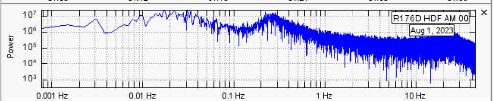
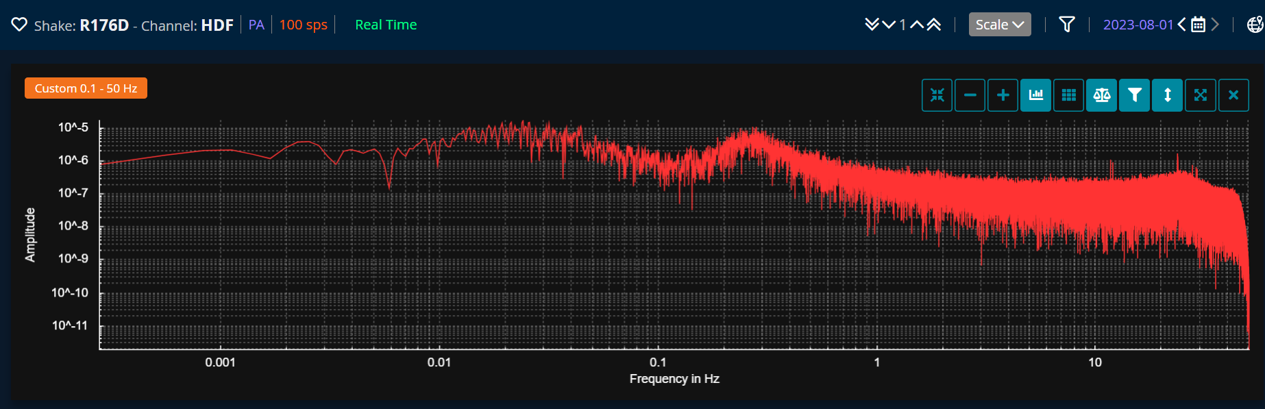
Regarding the difference in the Y-scale values, yes, as Philip stated, DV displays Amplitude, while SWARM shows Power.
As of now, yes, it is not possible to integrate more than the current 60 minutes of data.
No, the spectra display is left completely unfiltered by default, but maybe we can add a toggle setting that will allow you to see how filters affect it after turning it on. I will pass this on to our dev team to see what they can do. Thanks for the suggestion!
I have some comments/complaints about these spectra:
Fourier spectra are only valid for non-stationary data, i.e., no matter what size window you take, the variance of the signal should be the same. This clearly does not apply to signals with an EQ in them.
The Fourier transform eliminates all time dependence by integration, so the transient part of the signal is averaged out. So, if you’re looking at EQs, what’s the point of the spectrum? Spectrograms retain some time dependence and should be used for transient data.
The spectrum shown in SWARM and its successor is just the FFT of the signal - I’m not sure if it is windowed first. To do this properly, there should be either ensemble or frequency averaging. In ensemble averaging, you take the signal and divide it into equal parts, then take the FFT of each part and average. For frequency averaging, you do a running mean over the spectrum that is shown. These averaging processes will produce a smooth spectrum instead of the messy one that SWARM presents. From this, you can do all sorts of analysis. For example, the slope of the decay may differ from site to site depending whether the instrument is on alluvium, igneous rock, or whatever. The existing spectra have so much noise, you cannot detect this. The noise is irrelevant and should be removed by averaging.
I think we can guess that the amplitude graph uses 1 pascal as the dB reference value.
For “power” it’s trickier. You expect power to be watts. If you have sound pressure, to calculate the power of the source, you need to know the distance from the measuring point to the source*.
Perhaps they mean sound intensity - which is measured in watts/m^2.
You would expect this to be a tiny number (having a negative exponent) not 10^5…
I think the problem is that my copy of SWARM appears to be working with counts, not Pascals.
That multiplies things by 3.136*10^9 if you consider that power requires squaring pressure.
If I subtract 9 from the exponent in the SWARM and divide by 3, it gets me into a range that looks reasonable.
Ken
If we can triangulate the distance to the source, we can estimate the sound power of the source - something I had not considered.
I hope I posted this in the infrasound topic. If not - sorry.
Many infrasound sources are more or less continuous (industrial machinery, for example). Impulsive sounds (explosions) are not amenable to FFT, except to the extent they excite a resonance somewhere.
no comment
It seems like the spectra display takes into account the entire time period you have selected in the waveform display. The bigger this window, the smoother the spectrum is - especially the low end. For really low-frequency sources (microbarom, etc) it’s useful to be able to select quite a long period.
it seems there’s some confusion as to what the spectrogram in both swarm and dataview are trying to show.
you are correct that the spectrogram in swarm and dataview are a simple FFT of the time-domain data: a visualization of the time domain data converted to the frequency domain. this conversion indicates nothing more than the relative noise levels, at specific frequencies, at a specific moment in time.
neither swarm nor dataview is a tool intended for the type of data analysis you describe, they are data visualization tools only, applying a minimum of analysis (e.g., filters). to do the more advanced analyses you prefer, which is indeed very interesting, other programs designed for this are better suited.