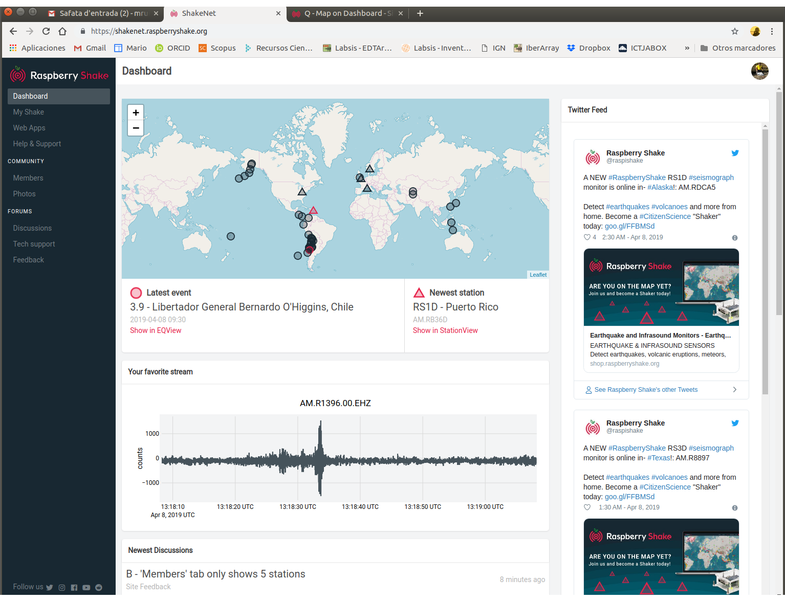
Map on Dashboard is confuse for me. Perhaps I don’t undertstant but I only see 5 stations (triangles), one of them in red (a New one in Puerto Rico) and a lot of epicenters ¿?. What I would expect in the main page is a map with all the RS stations, and perhaps the last epicentral solutions.
I’m also using:
Linux hyperion 4.14.98-v7+ #1200 SMP Tue Feb 12 20:27:48 GMT 2019 armv7l GNU/Linux
Chromium - Versión 72.0.3626.121 (Build oficial) Built on Raspbian , running on Raspbian 9.8 (32 bits)!
that is, this is intended as an overview of recent activity, not a complete redisplay of the station view webpage. the station view webpage will not be going away, so switching to station view will get you what you want.
however, it is possible to add a key to the map describing the details of this view to reduce possible confusion about what one is exactly looking at, this will be added.